Brand Identity, Illustration, Website Design & Development, Label Design, Mini Brand Guidelines, Template Design, Graphic Design


At the heart of Amaha is a space for presence. A place where people can align with their intuition, embrace the present moment, reflect on their journey, and gently release what no longer serves them — past, present or future. The result is a sensory and soulful experience that honours beauty, heritage and storytelling from around the world.
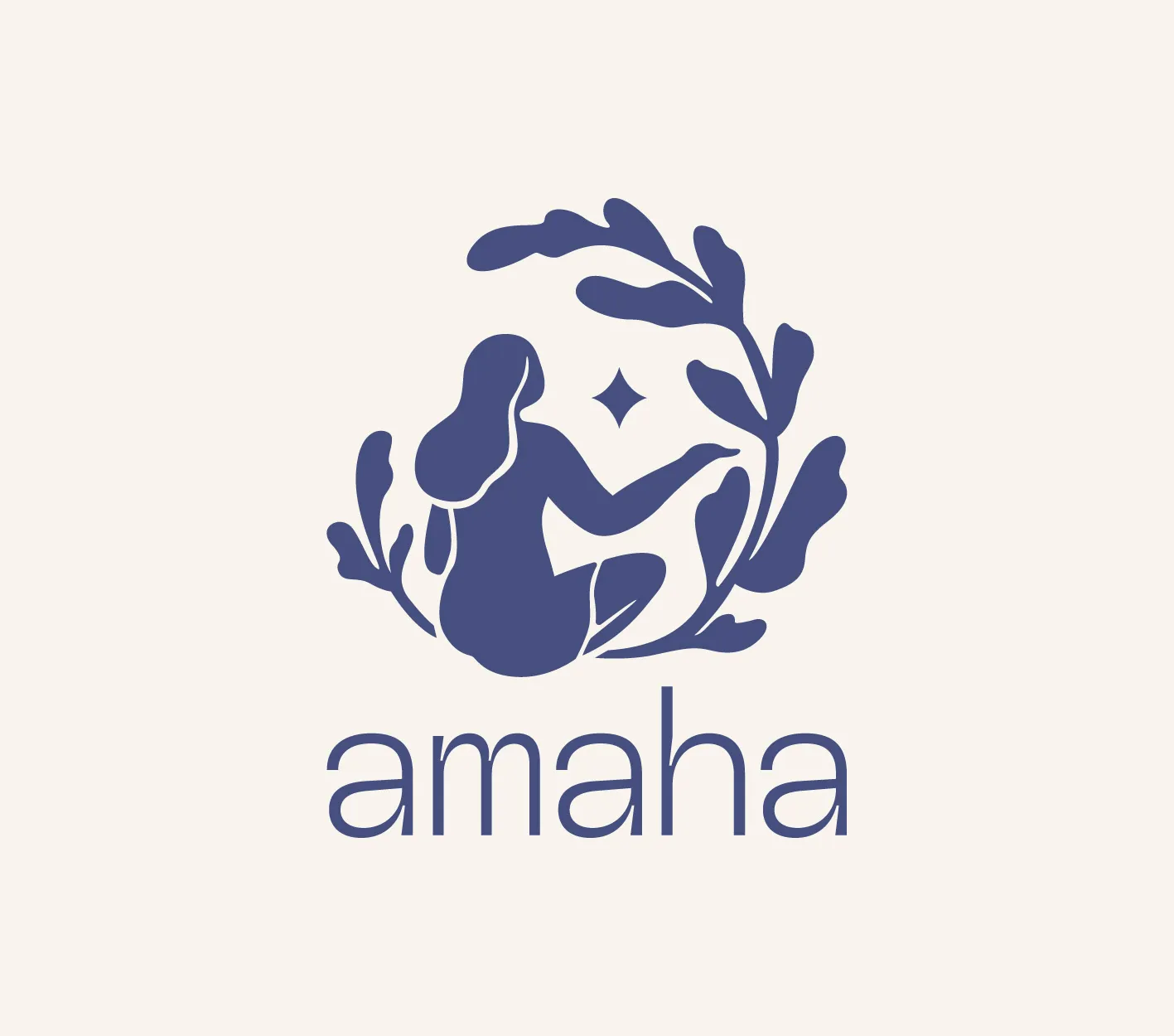
Coside was tasked with crafting Amaha’s master logo, a visual embodiment of a sensory experience: sight, sound, scent, taste and touch. The design needed to reflect the brand’s values of connection to self, others and nature while also considering the space it occupies. It had to balance light and dark, joy and reflection. A deep understanding of cultural nuance, storytelling and emotional design was essential to create a refined and meaningful brand mark.
The master logo is an abstract, symbolic representation of a grounded yet intuitive feminine figure. She is rooted in ritual, surrounded by nature and gazing toward the stars – a reflection of the inner and outer journeys we all take.
We Illustrated it in a perfectly imperfect, rhythmic style, the form is both modern and timeless. Organic circular motion represents the cycle of life and nature while abstract flora hints at the global origins of Amaha’s offerings. Circular shapes throughout the mark symbolise unity, protection and cosmic connection. They tie the physical and spiritual together in a gentle, harmonious flow.
An "aha" moment of discovery is embedded in the design. A subtle, unexpected element that the viewer may not notice right away, designed to spark reflection and build a lasting emotional connection.
The wordmark beneath the illustration mirrors the rhythm and intentionality of the brand. It features a delicate yet deliberate line weight and a modern, clean aesthetic. The typography feels effortless yet thoughtful, joyful yet grounded.
The colour palette follows the same philosophy. It is modern, muted and gender-neutral, offering subtle beauty without relying on predictable earthy tones. These colours reflect Amaha’s connection to nature in a contemporary and approachable way.
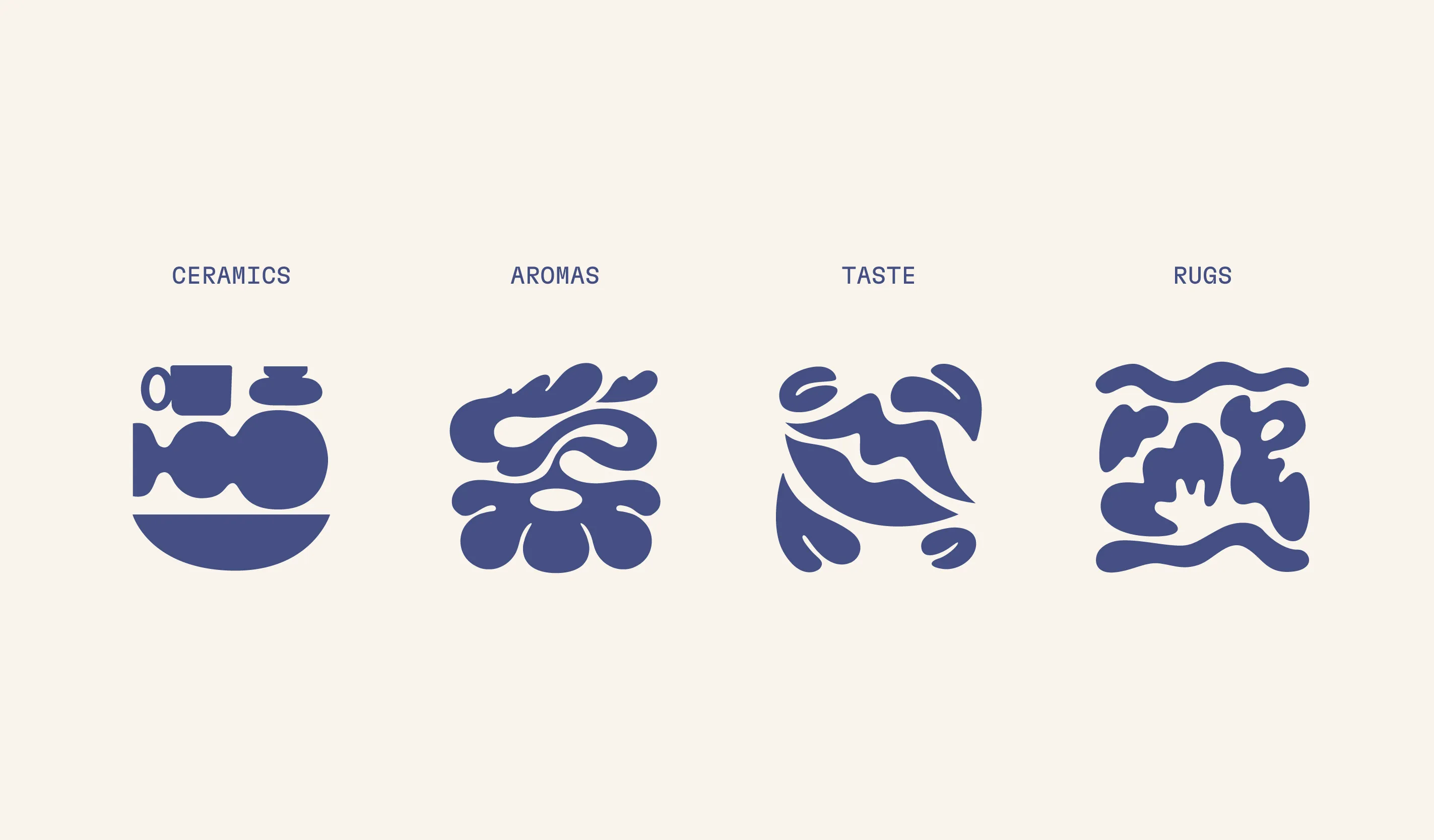

Illustration as a Visual Language
The central figure is more than a logo. She is a storytelling device. With eyes to the stars and feet grounded in nature, she represents Amaha’s philosophy of being emotionally strong, guided, and balanced. A central star within the illustration acts as a navigation symbol, a guiding light for life’s journey.
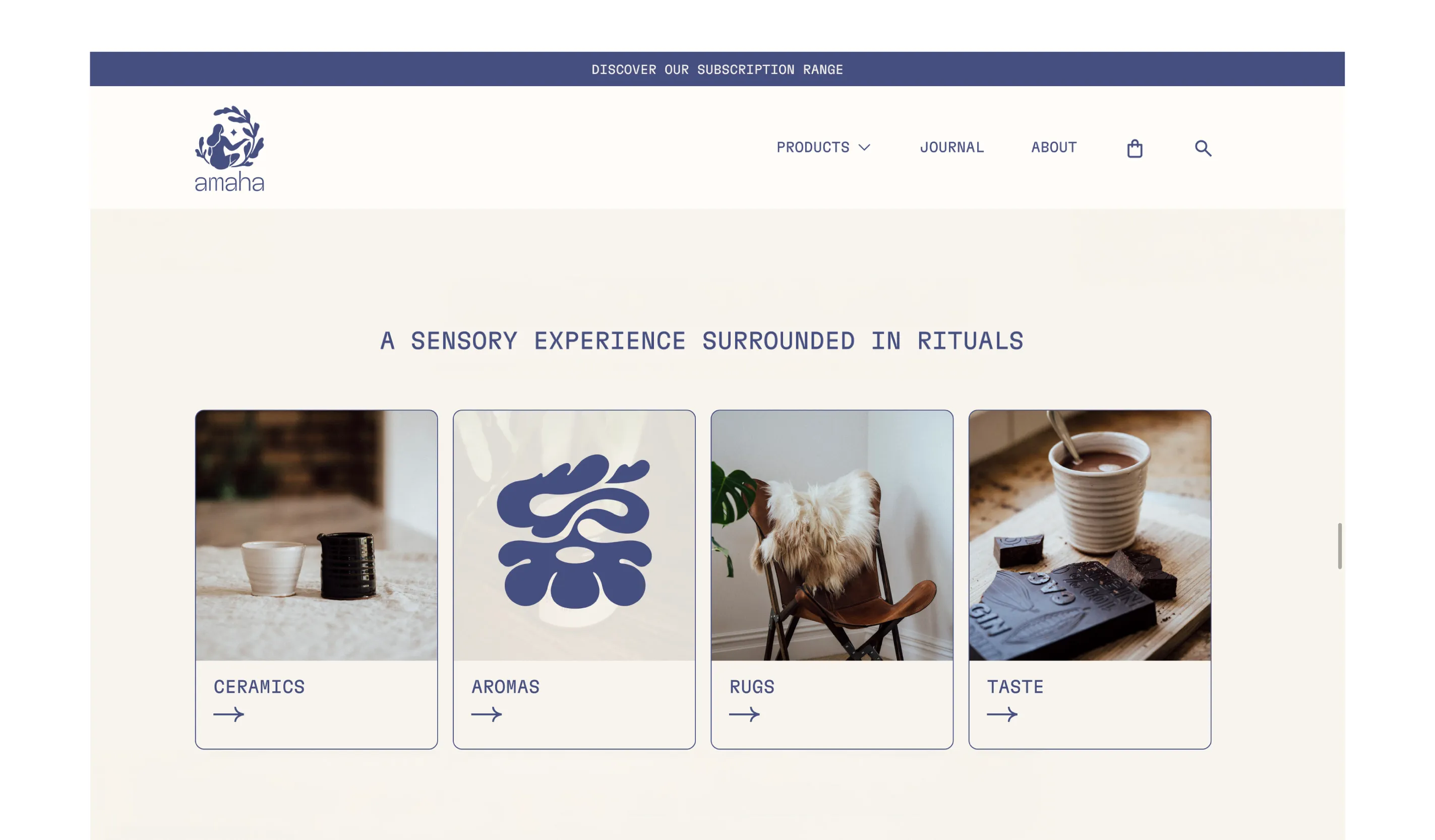
Illustration plays a key role in Amaha’s visual language, extending seamlessly to products such as: Rugs, Ceramics, Aromas, Taste.
Each application amplifies the sensory richness of the brand and creates a deeply immersive customer experience.
Coside has also developed a suite of label designs for Amaha’s essential oils, using foil stamping and textured paper to evoke a tactile, natural elegance without feeling pretentious.
An e-commerce website is currently in development. It features smooth transitions and an editorial-style layout that reflects journaling and storytelling. The digital experience will be as intentional and immersive as the brand itself.
Amaha is more than a brand. It is a space to be.
Watch for the full case study rollout coming soon.