Brand Identity, Product Photography, Website Design, Copywriting, Graphic Design

When we began designing the Haul Safe logo, our goal was not only to create a strong visual identity but to communicate the brand’s deeper purpose: enhancing safe trailer practices and ultimately saving lives.
The Haul Safe Device exists to help prevent trailers from dismounting from a tow ball and to reduce high-risk accidents for everyday users and companies alike. Because of this, we knew the identity needed to feel dependable, intuitive and grounded in its real-world function.
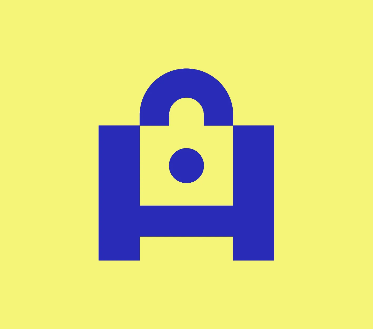
To reflect this mission, we developed a geometric graphic device built from precise, clean shapes all centred around a clear, instantly recognisable motif — the lock.
At first glance, the symbol communicates structure, protection and reliability. Look a little closer and the subtle “H” from Haul Safe reveals itself within the form. At the centre sits a circular shape representing the tow ball that the device secures — a direct nod to Haul Safe’s life-saving purpose.
This emphasis on safety is also influenced in the logo’s personality. The bold, wide typography pairs with the geometric device to create a sturdy, confident presence. Soft curves reference road contours and movement, reinforcing the idea of travelling safely and securely. Every detail was designed to mirror the behaviour Haul Safe encourages: slowing down, securing things properly and protecting those on the road and in the wider community.
The device’s versatility was another deliberate choice. Because Haul Safe assists users both while towing and when a vehicle is parked with a trailer attached (especially when paired with a padlock) we designed a symbol that can live across every brand touchpoint. Whether used as a website favicon, a social icon or an animated brand asset, it strengthens brand storytelling and reinforces trust through consistent visual cues.
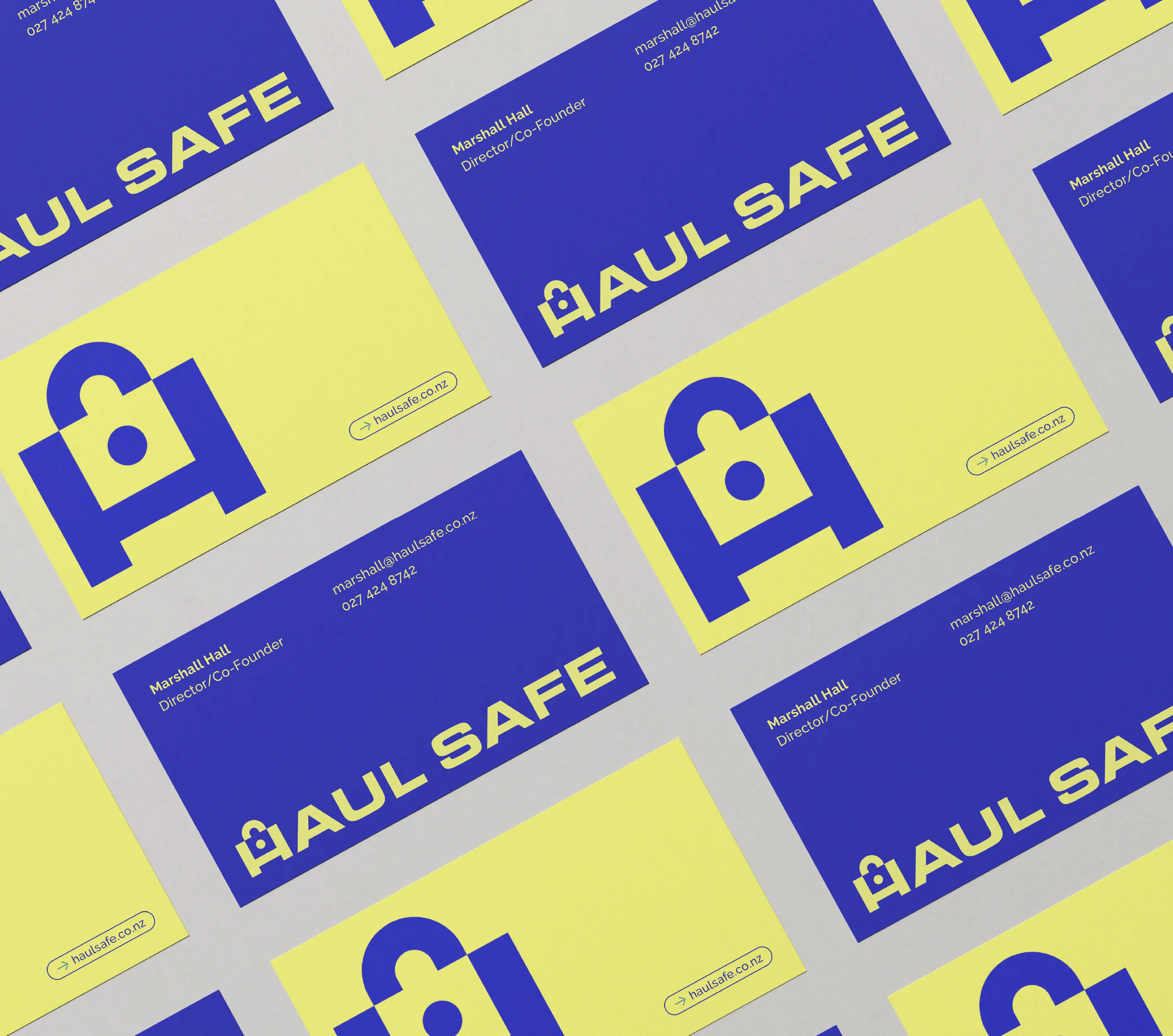
The colour palette further supports this mission. We crafted bold, contemporary hues that feel innovative without leaning on predictable safety colours.
A signature yellow highlights the locking barrel on the device. As the most luminous colour in the spectrum, yellow commands immediate attention, remains highly visible at speed and distance and is accessible even for colour-blind users. Its strong association with visibility and road safety ties directly back to Haul Safe’s purpose.
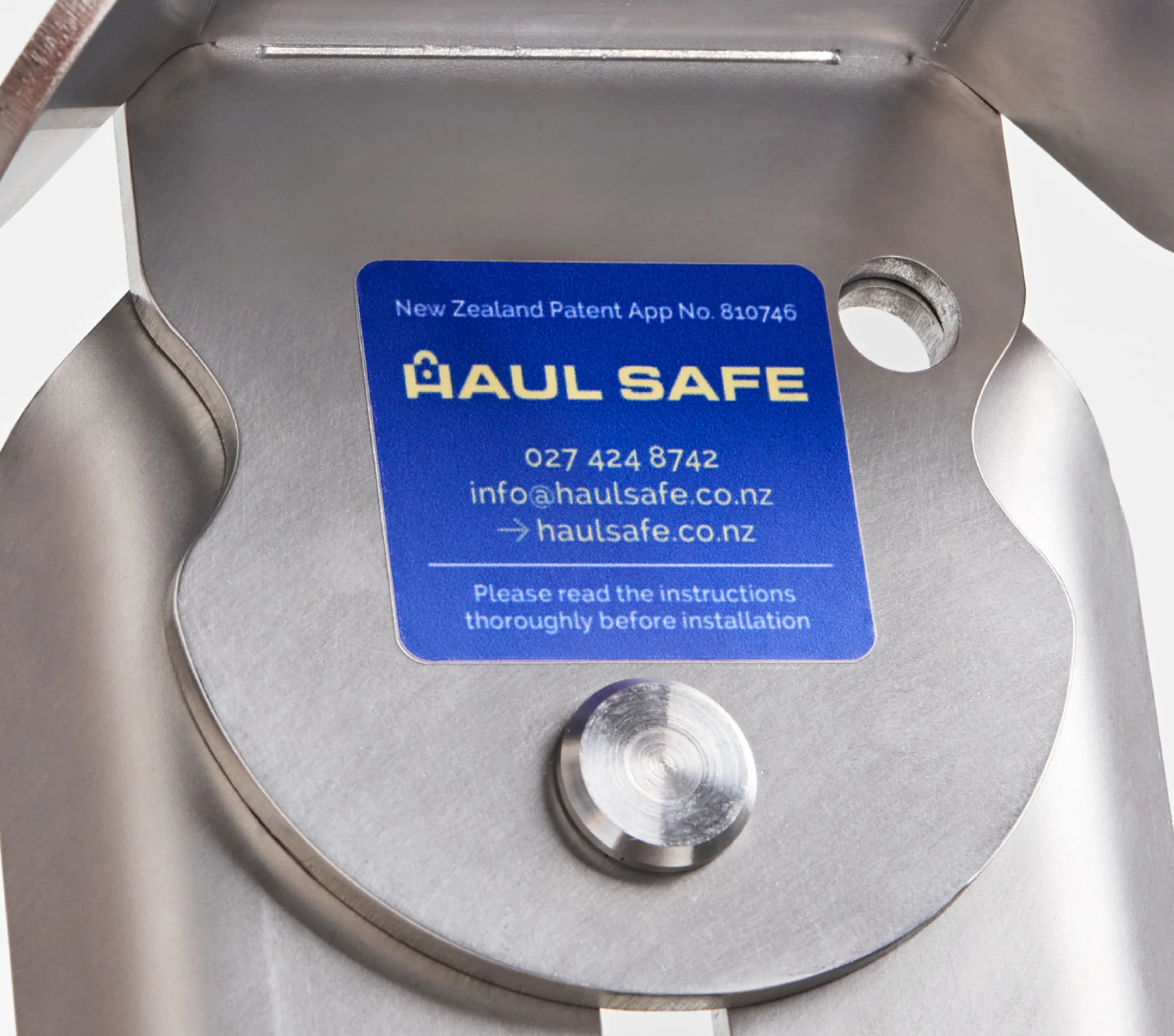
To reinforce the brand’s durability and reliability, we created business cards printed on a thicker than the average paper card stock. This tactile detail helps communicate the robust nature of the product and leaves a confident, lasting impression.

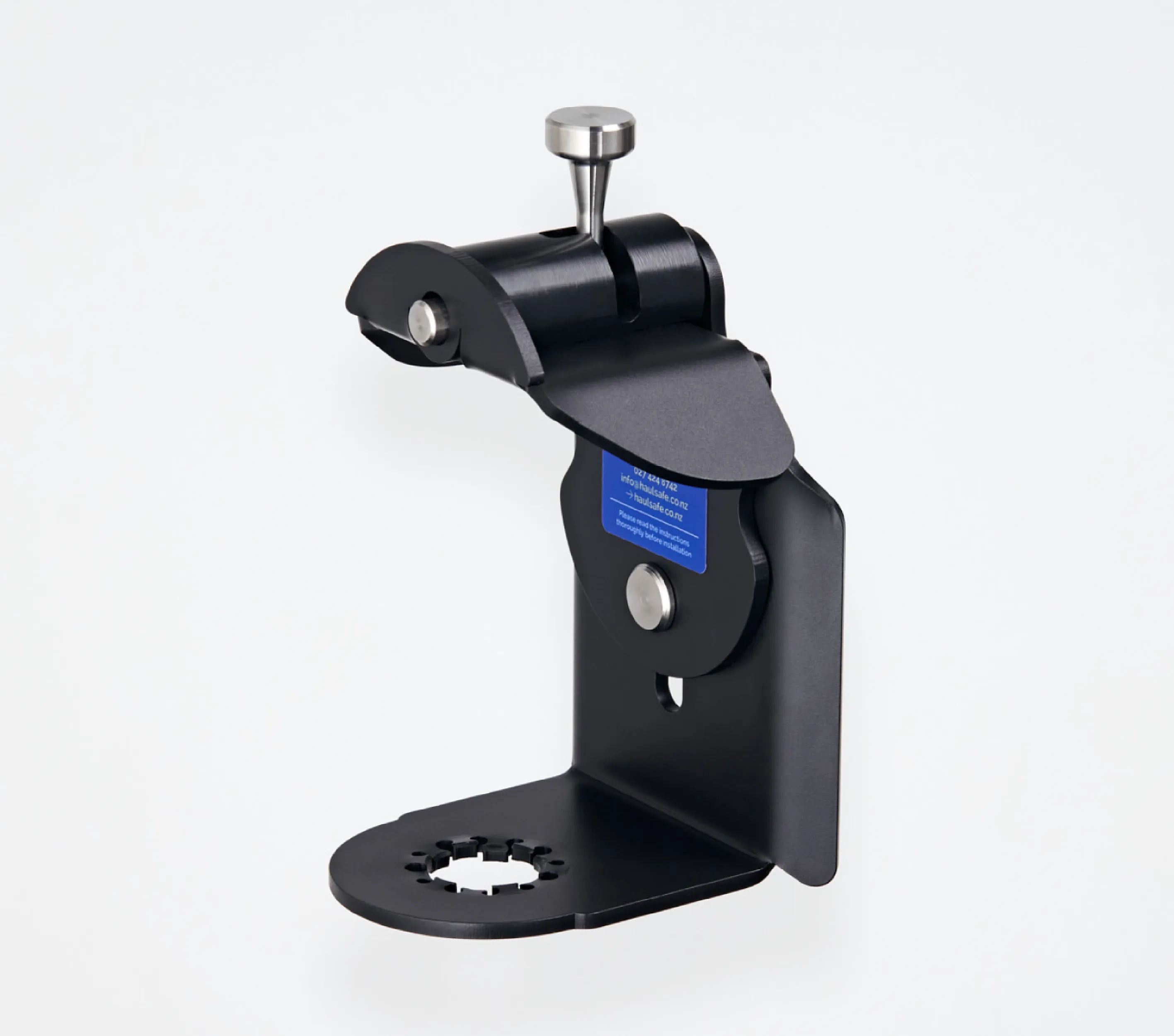
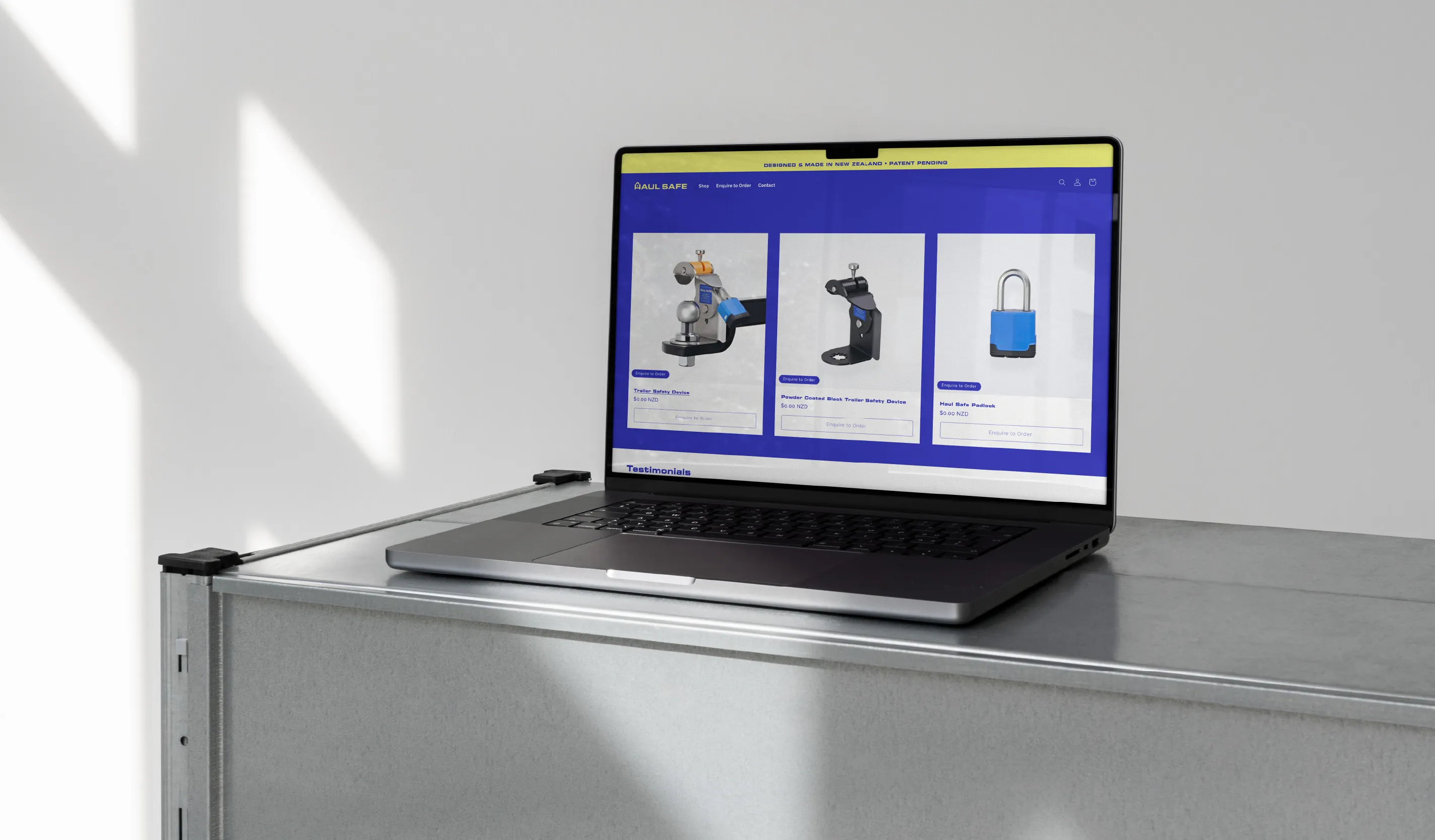
Product photography was captured on a clean, minimal and consistent background with multiple angles to give customers a complete understanding of the device. To provide full context, we included a tow bar and coupling in both static images and stop-motion video, creating engaging visuals for the website and social media assets.
We then created an easy-to-use Shopify ecommerce website with our Web Development parters Dotthei studio that is intuitive and delivers a hassle-free shopping experience. Designed as an interim website, it provides clear product information and highlights the most important aspects of the Haul Safe brand, helping to support sales during the start-up phase.
See more: haulsafe.co.nz