Brand Identity, Illustration, Graphic Design, Template Design
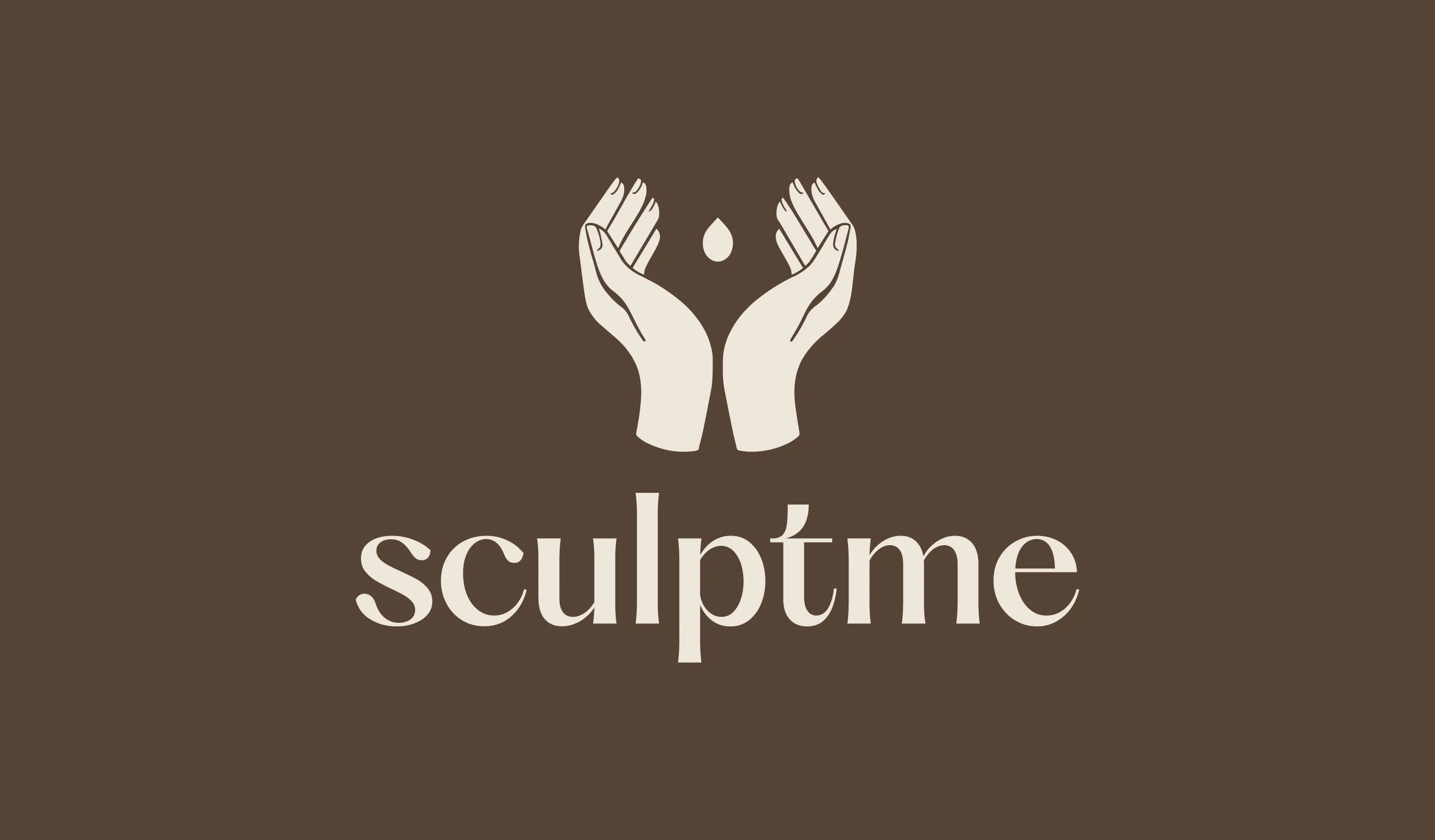
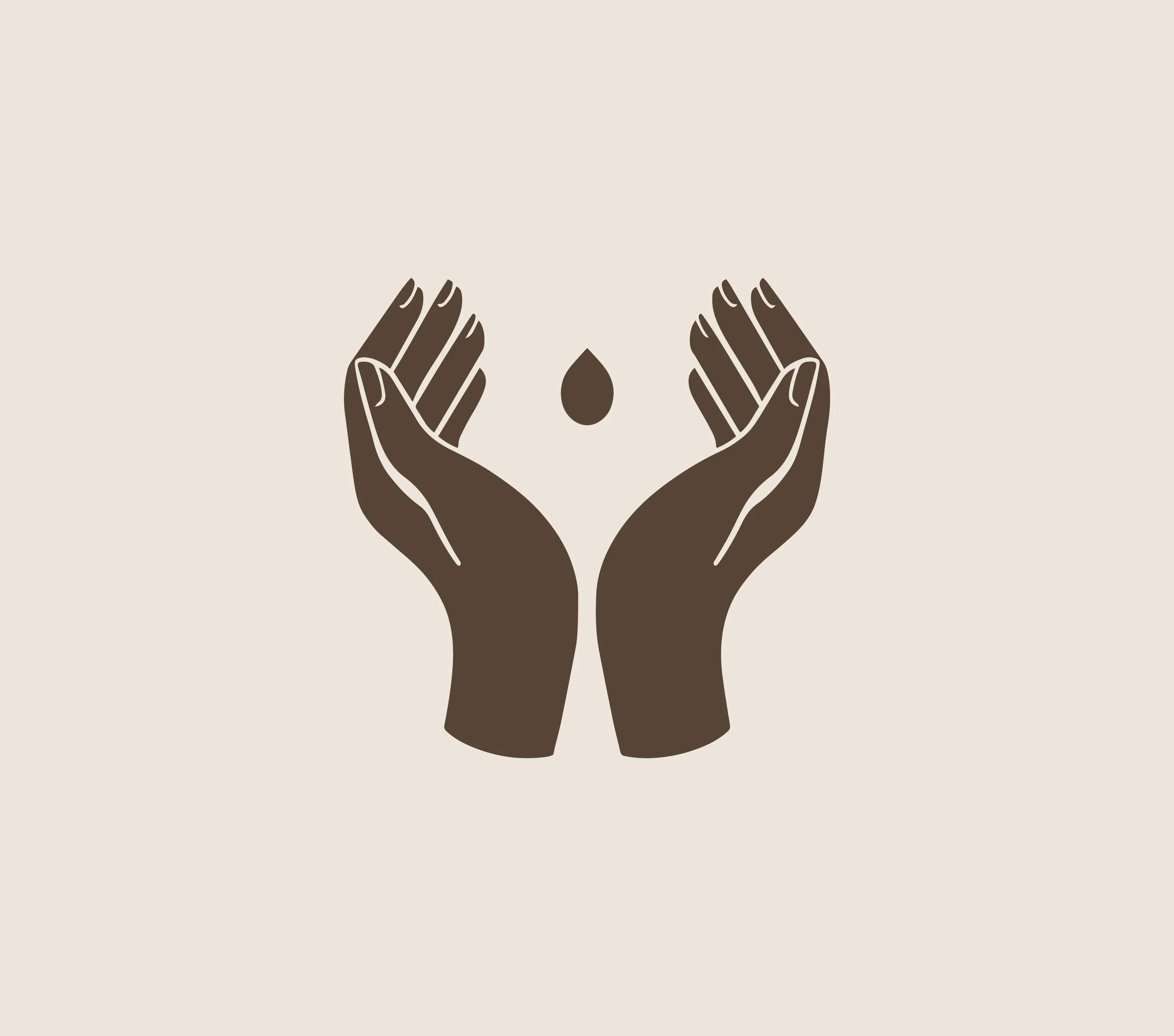
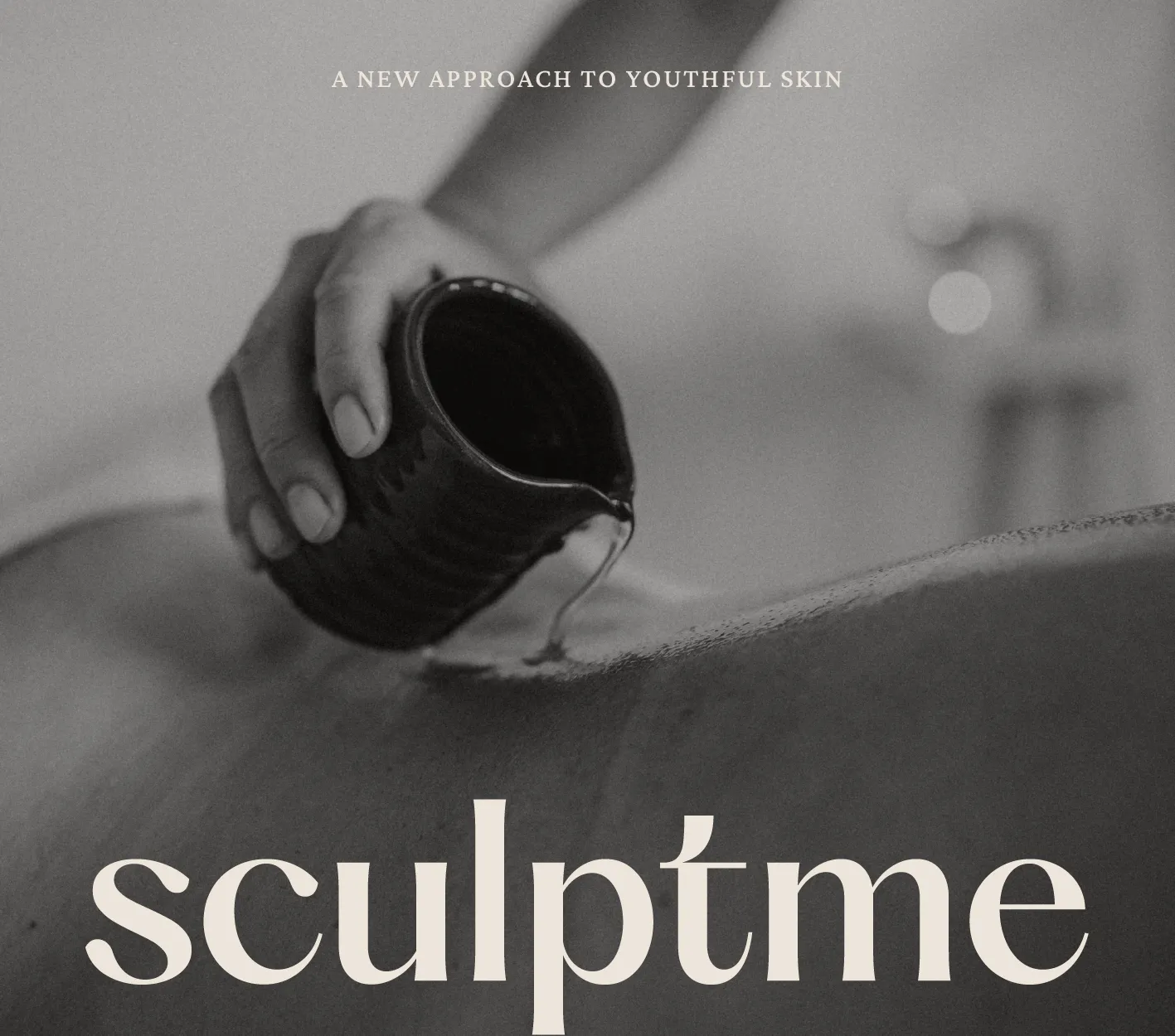
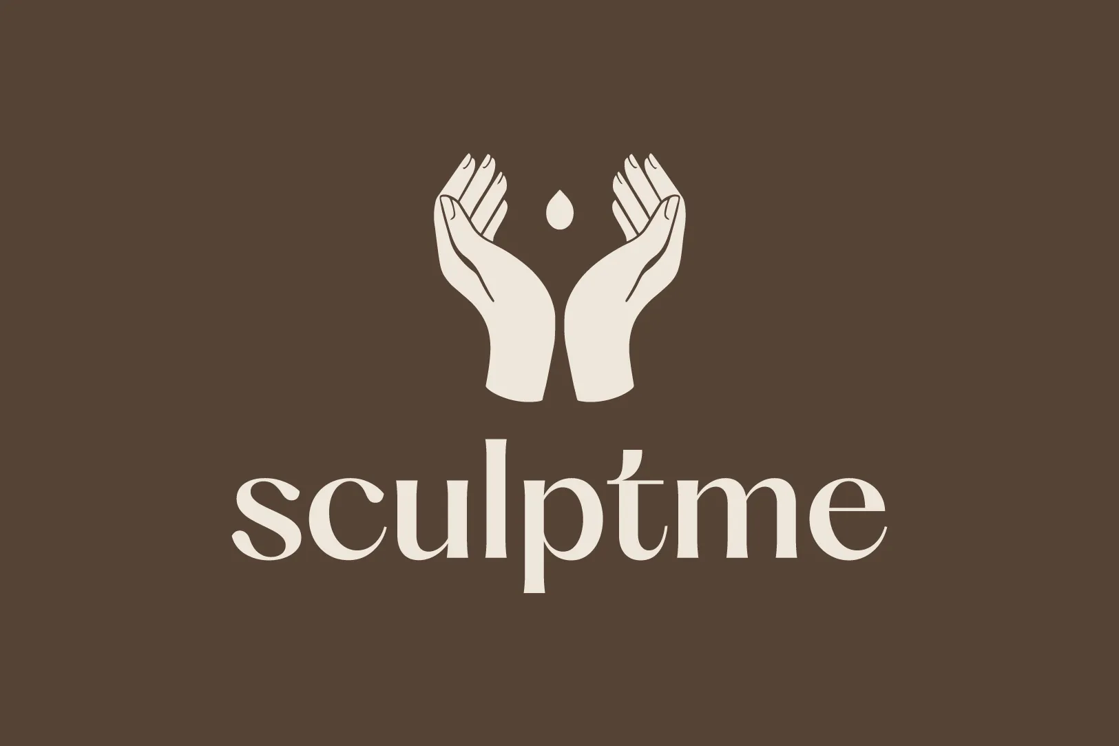
The Sculptme master logo was designed to reflect the transformative power of touch and the role of hands in sculpting both the body and the self. At its core, the identity captures beauty in motion, balancing calm, fluid energy with a youthful and inviting presence.
To convey this, we adopted a hand-drawn illustration style that brings a sense of natural movement. The logo features two gently cupped hands, symbolising care, tenderness and the nurturing aspect of bodywork.
Within this composition is a subtle silhouette of a human form, representing the holistic approach of Sculptme — one that integrates massage, movement and nutrition to support full-body well-being.
An abstract oil droplet sits at the heart of the mark, drawing focus to the handcrafted oil cherished by the founder and her clients. This shape also evokes the qualities of purity, relaxation, clarity and life’s natural flow — all key aspects of the Sculptme philosophy.
Together, these elements express beauty, confidence and transformation, guiding clients on their journey toward a younger, healthier self.
The logotype features an expressive serif, enhanced with a pearlescent finish and subtle, hand-rendered imperfections. This typographic choice introduces a sense of rhythm and movement, reinforcing the idea of ongoing transformation. It feels modern yet organic, effortlessly elegant with a youthful edge.
The illustration device is distinctly feminine and intentionally fluid, encouraging the viewer to soften, relax and reconnect with their body and inner self.

Full case study coming soon.