Brand Identity, Illustration, Infographics, Presentation Design, Microsoft Templates, Graphic design

Hercules Health (formerly Healthcare Compliance Solutions, HCSL) engaged us to redefine their brand identity to reposition them within the market.
Despite a strong track record they faced a key challenge: limited visibility and recognition as the preferred software vendor in their sector, especially with expansion into the Australian market. Our solution began with a complete visual overhaul.
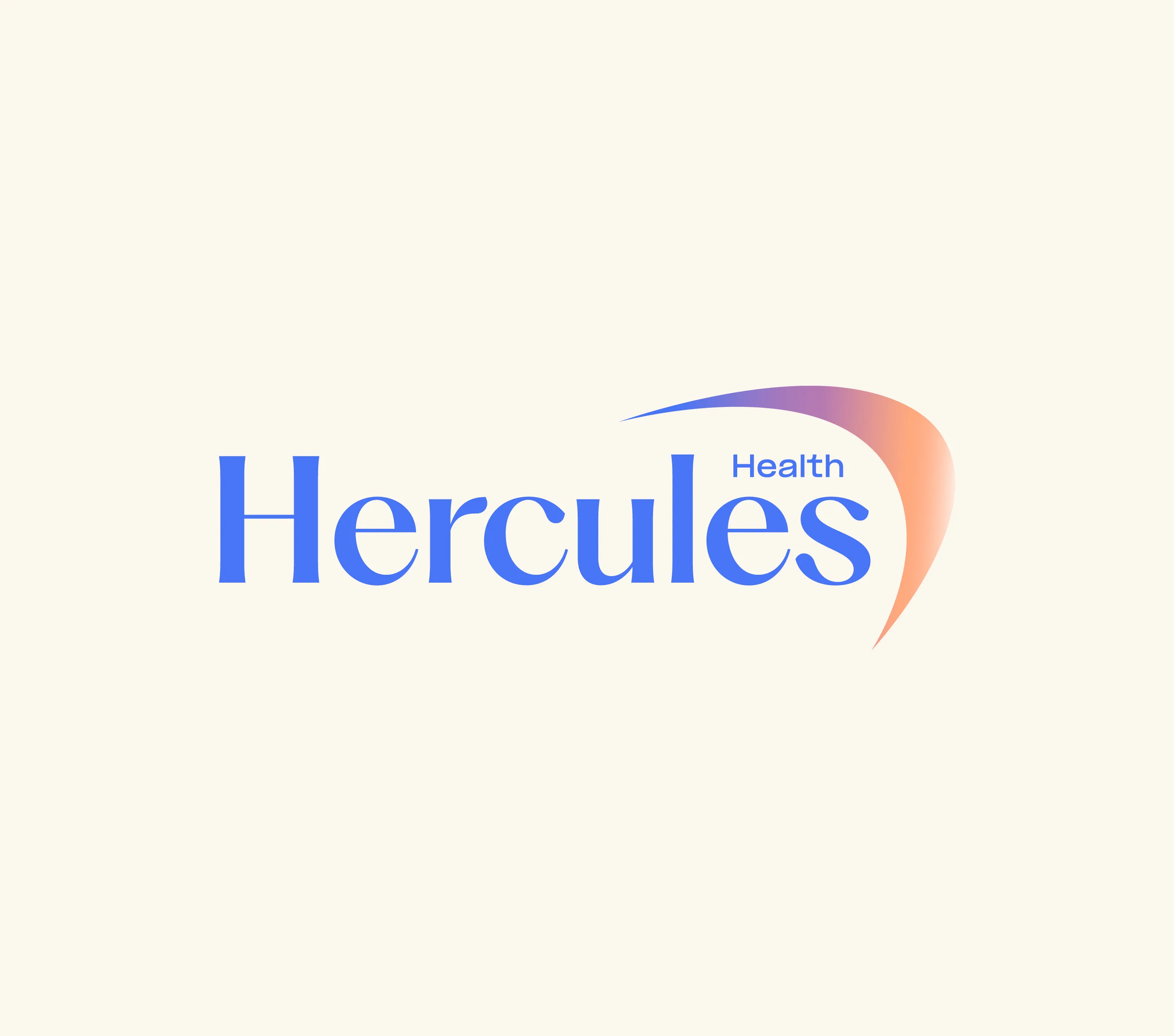
At the heart of the refreshed identity is a new name Hercules Health and a bold, modern logo. This is supported by a dynamic visual system of unique graphic elements designed to energise the brand and differentiate it in a competitive landscape.
Every brand element was crafted with a focus on innovation, approachability and professionalism while maintaining a calm yet confident presence—attributes that reflect Hercules Health’s core values. The result is a cohesive and purpose-driven identity that balances warmth and authenticity with a contemporary, future-focused aesthetic.
The transition from the HCSL logo to Hercules Health posed a specific challenge: evolving the identity while retaining recognisable elements that current clients associate with trust and reliability. To honour this legacy, we retained the arrow symbol from the original brand. It was refined to fit seamlessly into the new design, reinforcing continuity while signalling growth and innovation.
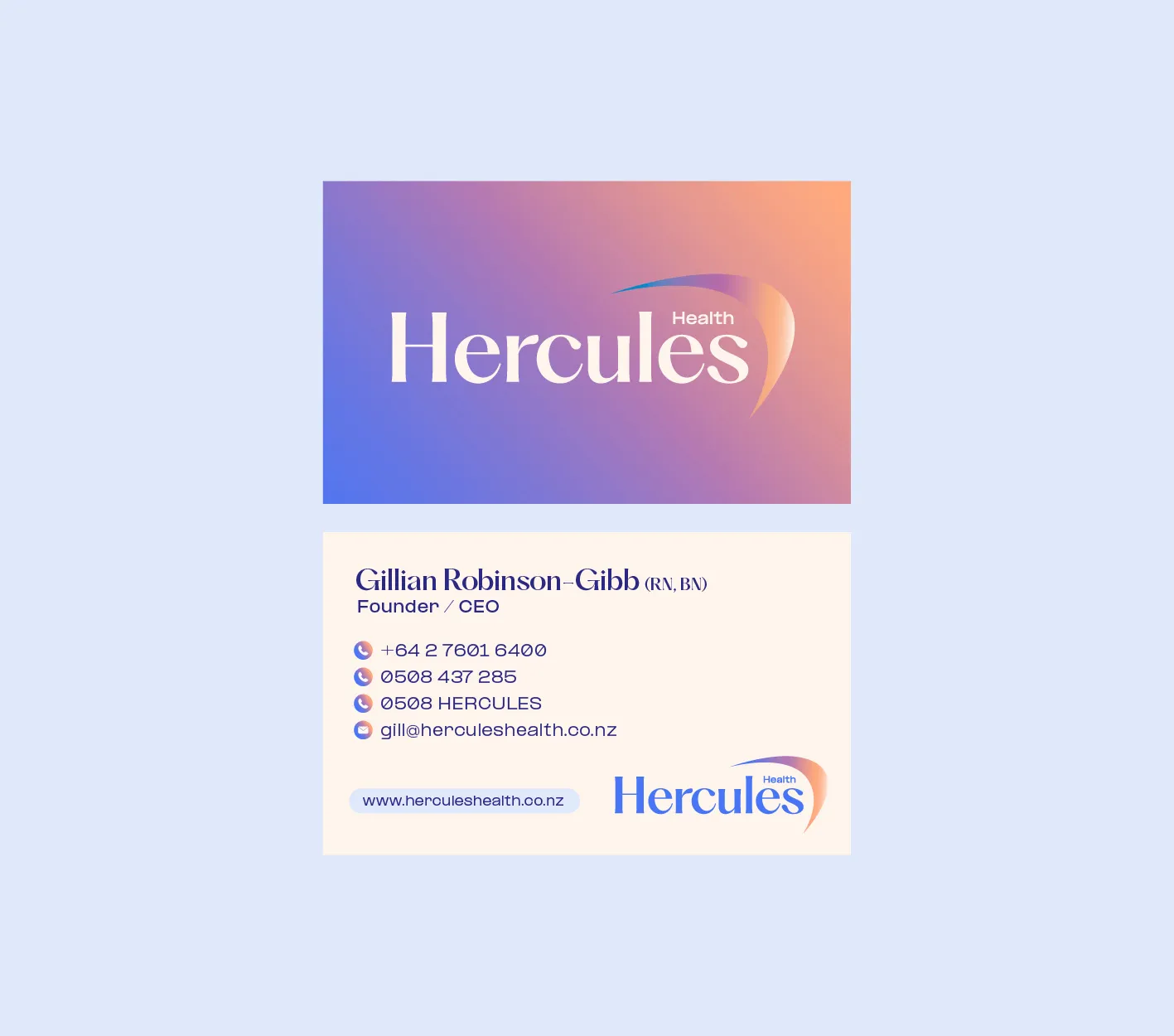
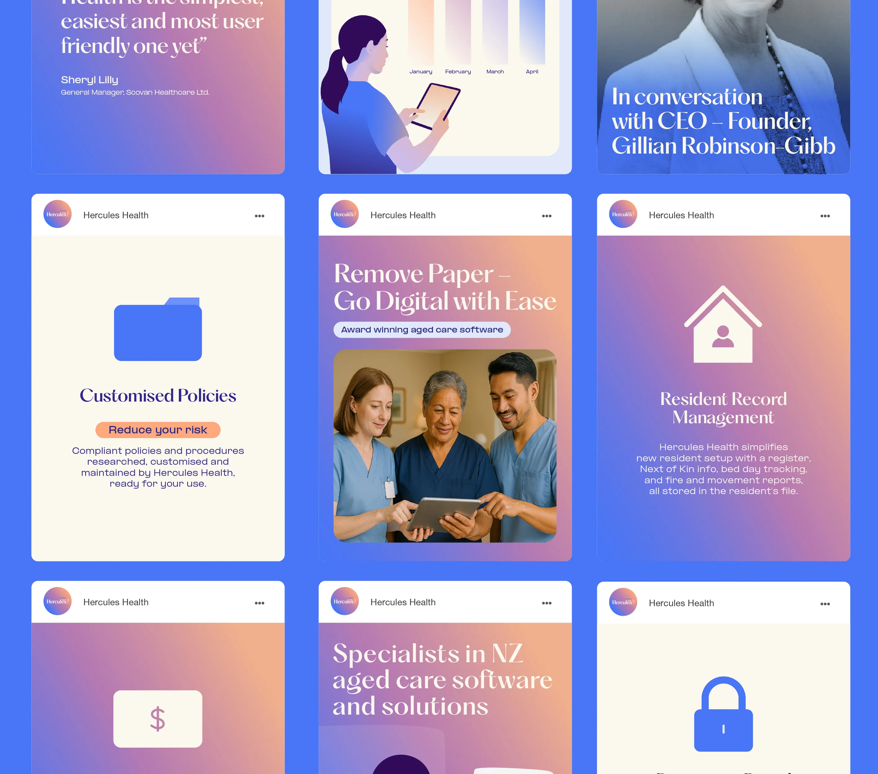
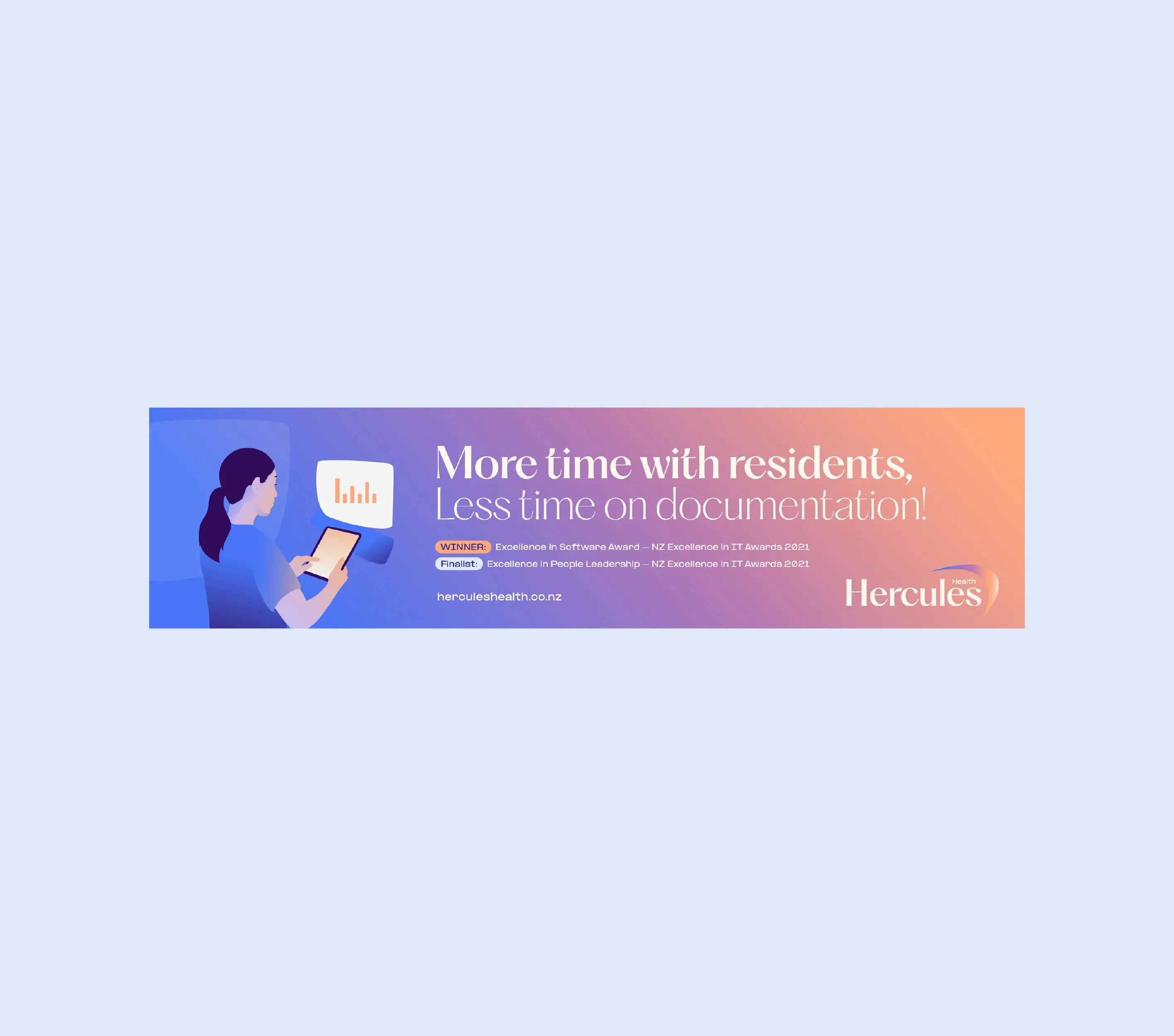
In a healthcare context, colour plays a crucial role. The refreshed palette was carefully selected to be calm yet strong. To add a modern and fun element, we developed a series of versatile gradients to be used as subtle background elements or bold focal points, transforming flat colour into more dynamic, layered visuals. When applied across the brand (from the master logo to digital interfaces) these gradients bring depth and energy, enhancing visual interest without overwhelming.


Custom Illustration:
To further differentiate the brand, we created a custom illustration that aligns with the boldness of the gradients. This offers a relatable and contemporary alternative to the generic stock imagery often used by competitors. The illustration features a healthcare provider using Hercules Health software on a tablet, reinforcing the brand’s practical connection to its users. In addition, we modernised the icon set to better convey innovation and better position Hercules Health as a tech-savvy, forward-thinking brand.
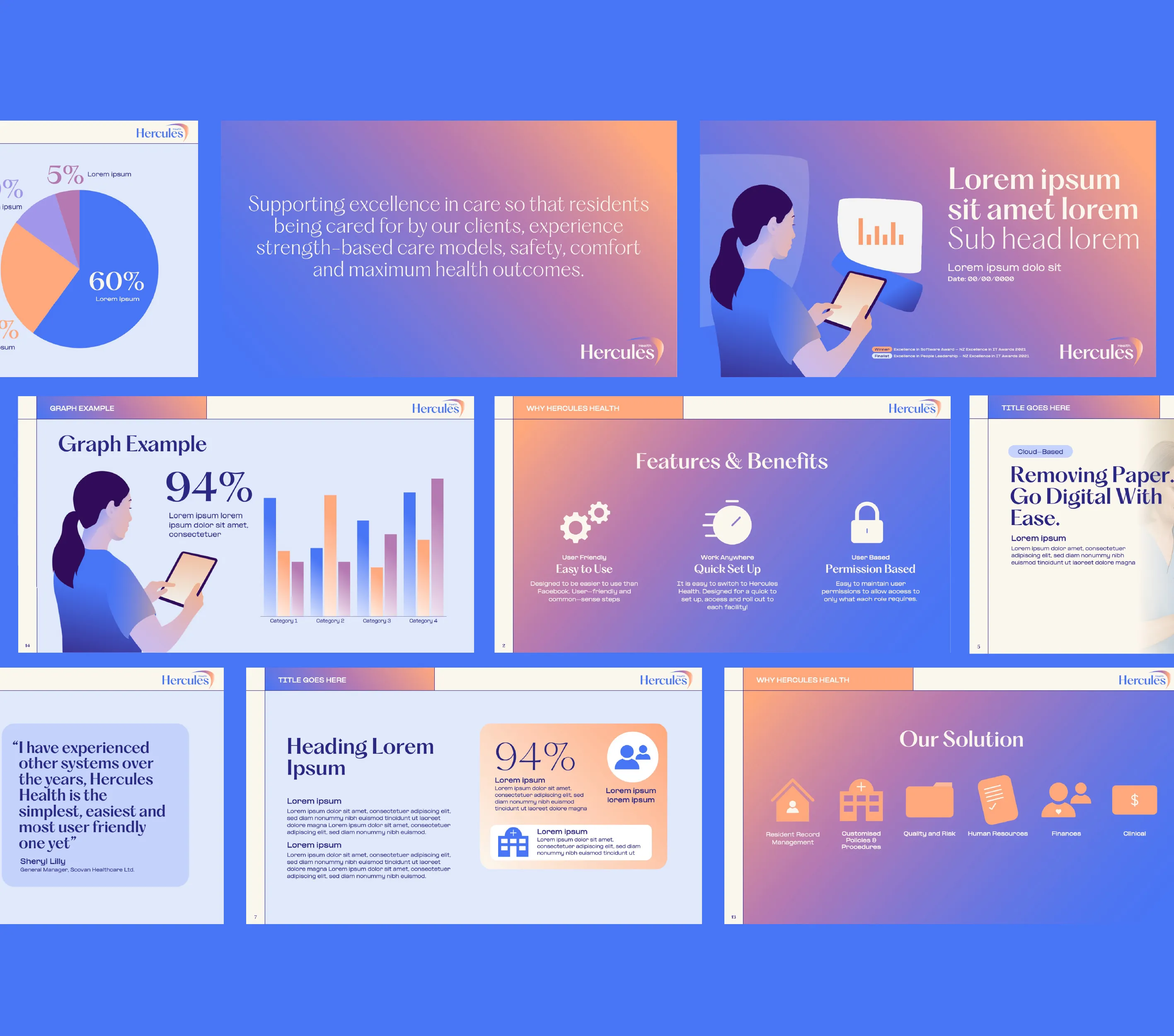
With the new identity established, Coside redesigned the brand collateral—ranging from event brochures and online banners to custom-branded PowerPoint templates and Microsoft Word document templates. Each asset was created with pre-designed layouts to ensure consistency across every touchpoint, incorporating the brand’s core elements: logo, colour palette, typography styles, iconography and illustration.

Hercules Health’s new identity presents a confident, composed and forward-looking presence. It solidifies their position as a trusted software vendor and a future-ready leader in the healthcare sector—both in New Zealand and as they expand into Australia.