Brand Identity, Illustration, Custom Website Design, Copywriting, Signage, Social Media & Facebook Advertising, Graphic Design, Project Management, Creative Direction
Theo’s Fisheries is a brand deeply rooted in legacy. For over 75 years, the same family has operated from the same location, delivering fresh, honest products.
Coside was commissioned to redesign the brand in a way that honours this enduring heritage while introducing a refined, contemporary identity that resonates with both loyal longtime customers and a new younger generation.
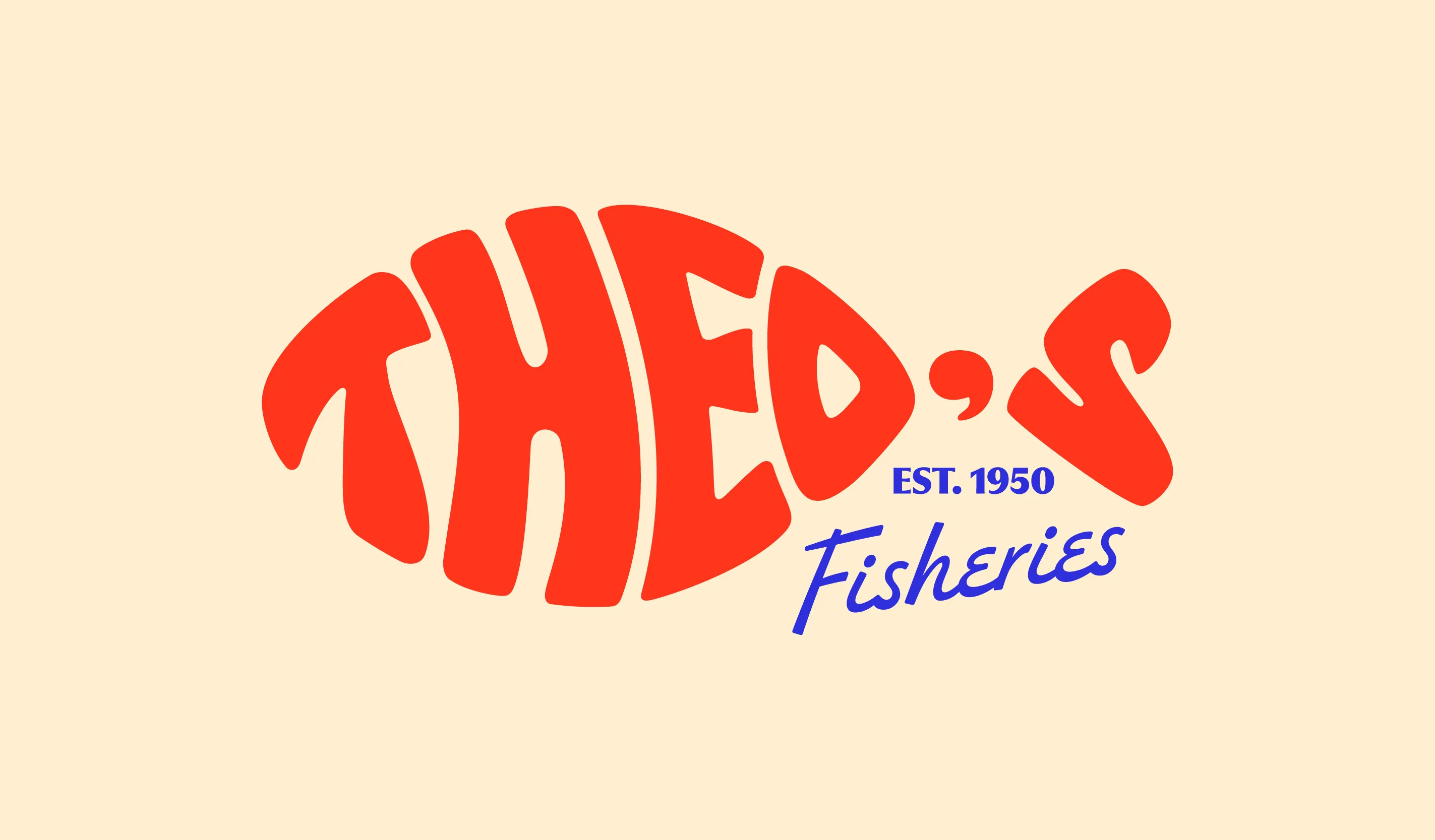
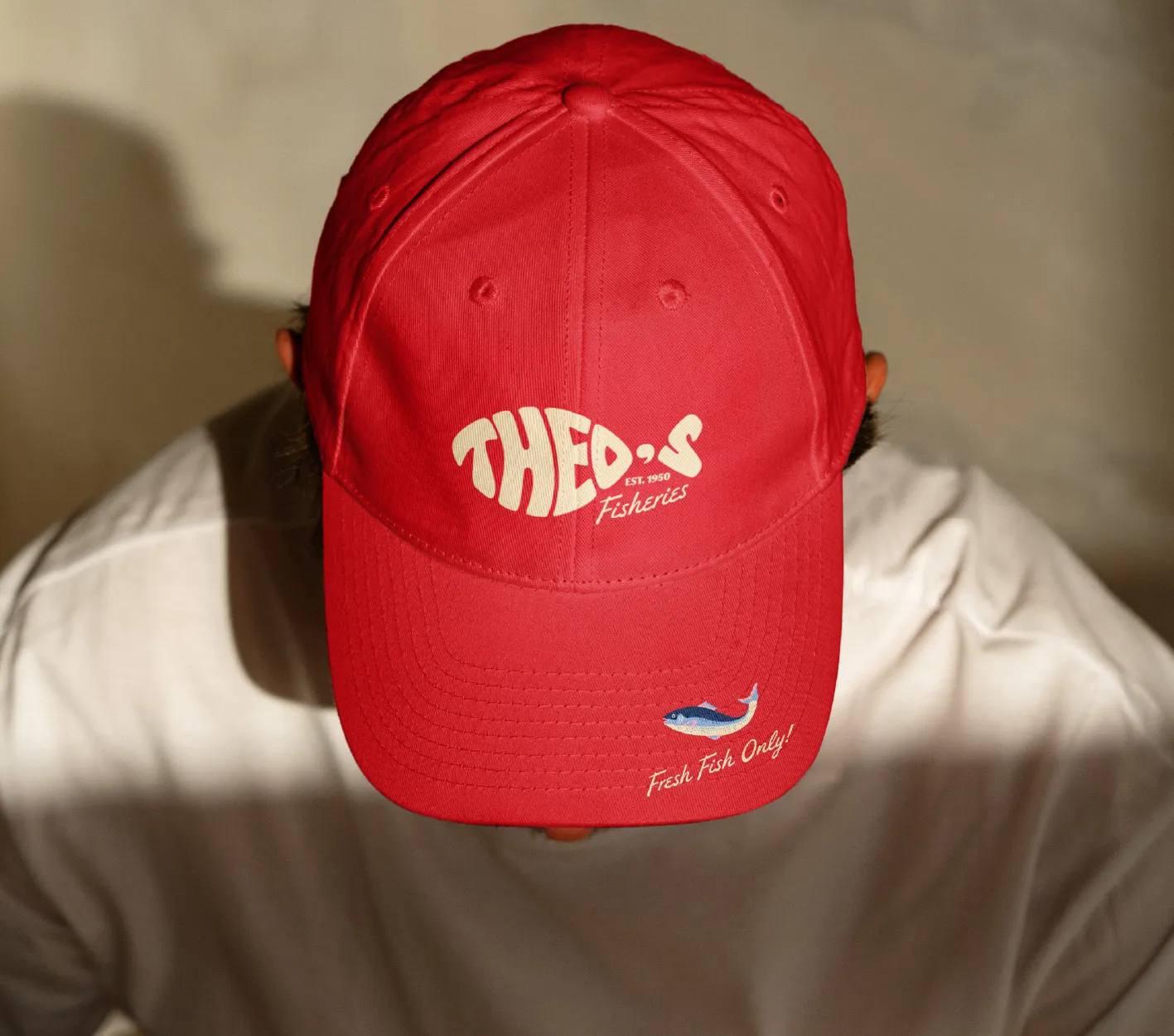
At the heart of the identity is the updated Theo’s Fisheries logo, serving as the key visual anchor that embodies the brand’s timeless values and ongoing relevance. Drawing inspiration from the original 1950s shopfront signage, the 'Fisheries' font has been carefully modernised to bridge past and present. The inclusion of ‘Est. 1950’ firmly roots the logo in its heritage while a bold, contemporary sans-serif typeface adds a fresh, energetic touch. The iconic typographic fish remains a trusted symbol of continuity, quality and craftsmanship with thoughtful design refinements made to improve its visual appeal, legibility and scalability across all platforms.
The refreshed colour palette blends boldness, warmth and nostalgia led by a bright red-orange, ocean blue and soft buttery yellow to capture the spirit of Theo’s Fisheries. Supporting tones like pastel blues, pinks and deep ocean blue add depth and versatility to the palette, connecting the brand’s heritage with a fresh, modern identity that appeals across generations.


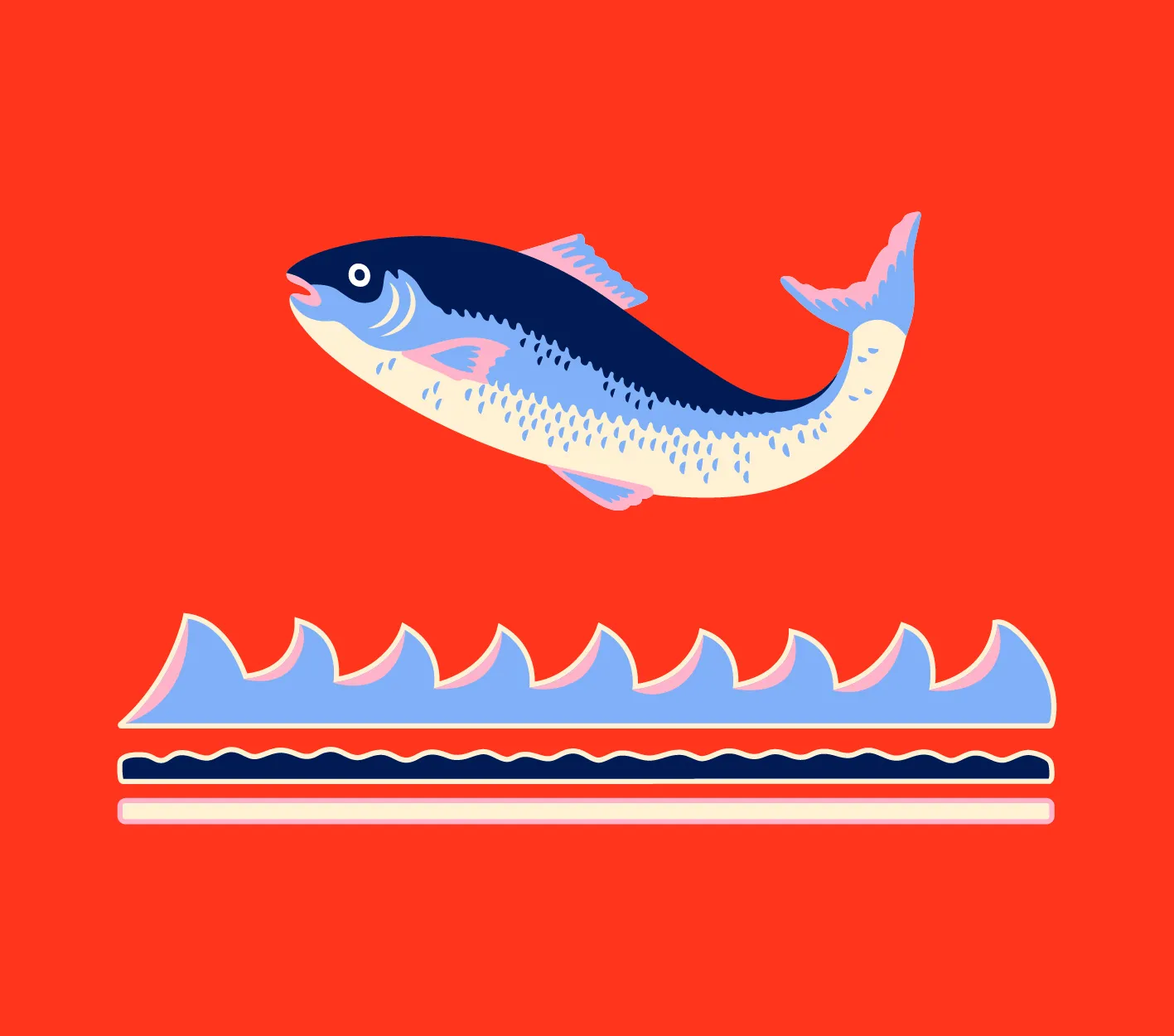
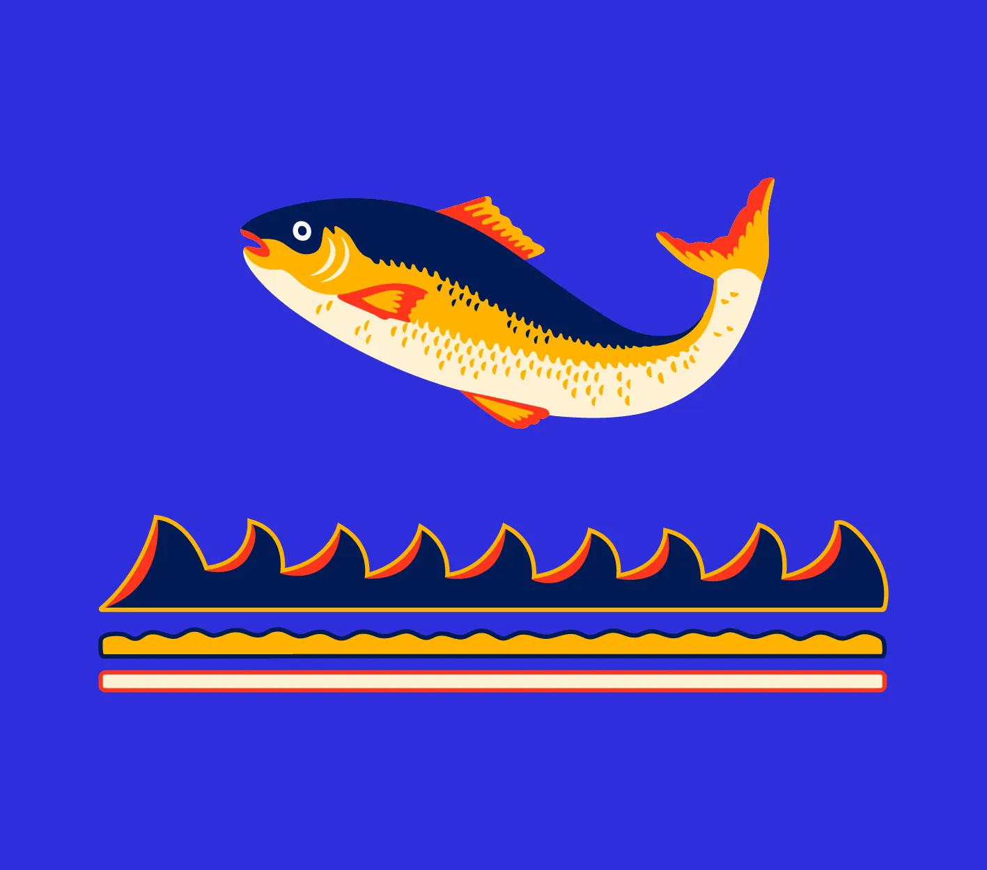
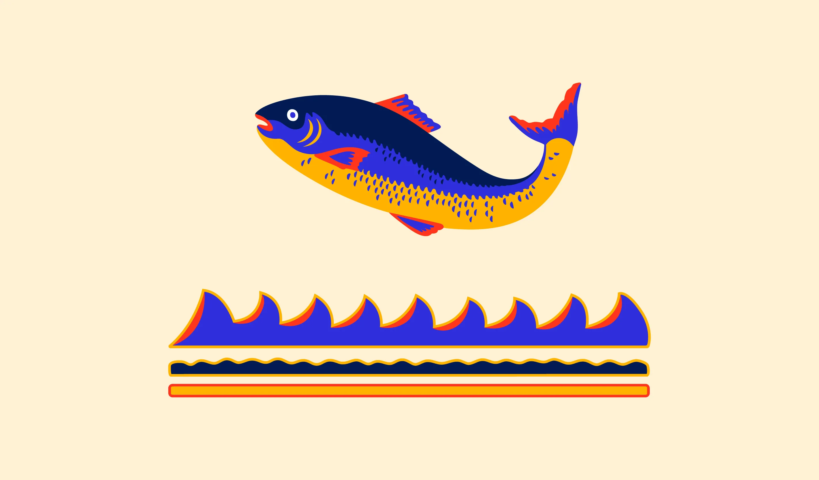
Custom illustration
Illustrations plays a key role in the brand’s storytelling. Inspired by the fish graphic once painted on the original shopfront window, the illustration style brings bold colours and imperfect lines to create visuals full of energy and character. The unique custom illustrations add emotional depth and visual texture, helping to connect the brand’s rich history with its present-day identity and storytelling across promotional and digital materials.
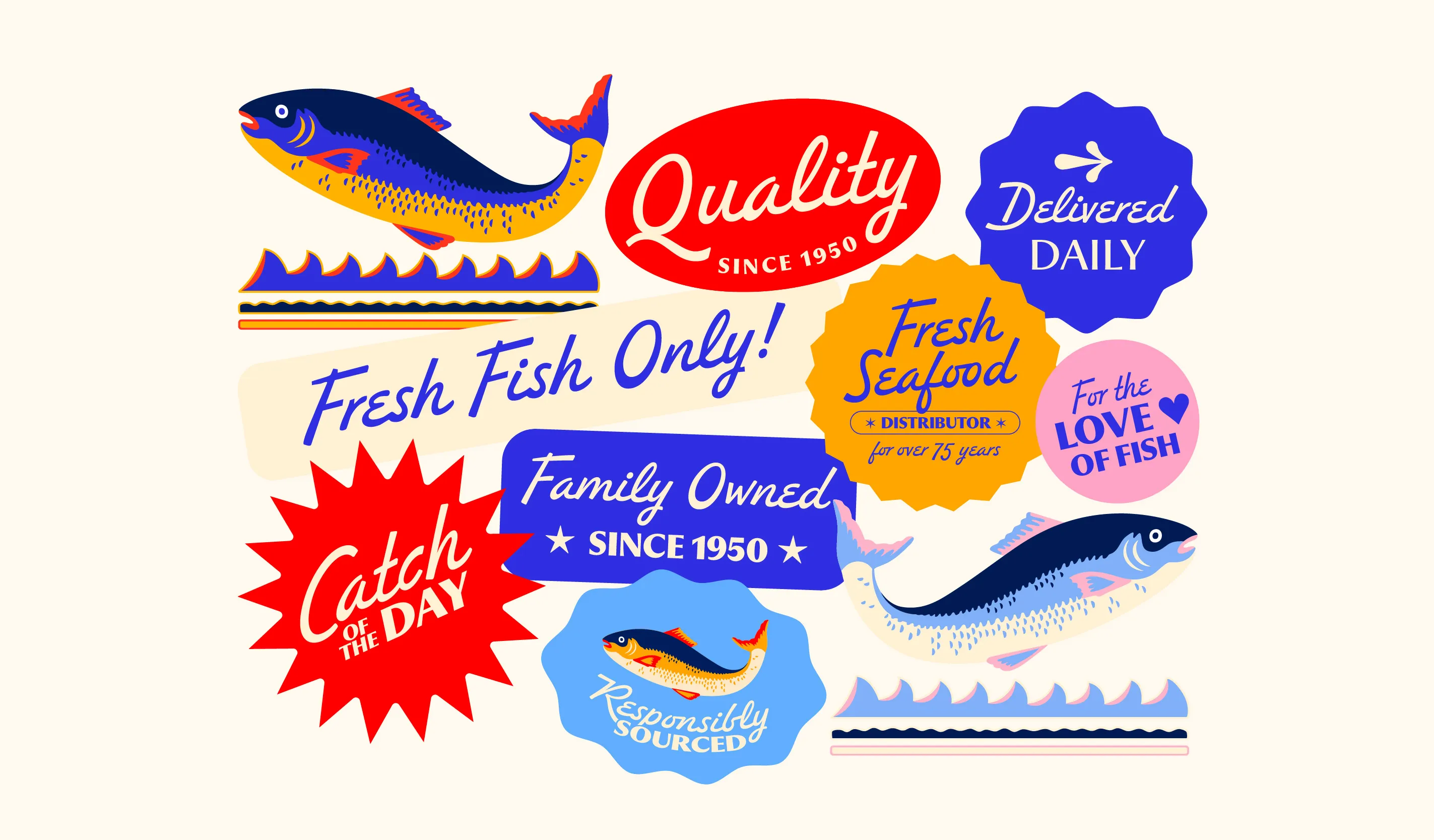
To further build personality and visual interest, a series of nostalgic yet modern badges and stickers has been developed. Whether used online or in print these small design elements highlight the brand’s creativity and storytelling while adding a charming reference to the past.
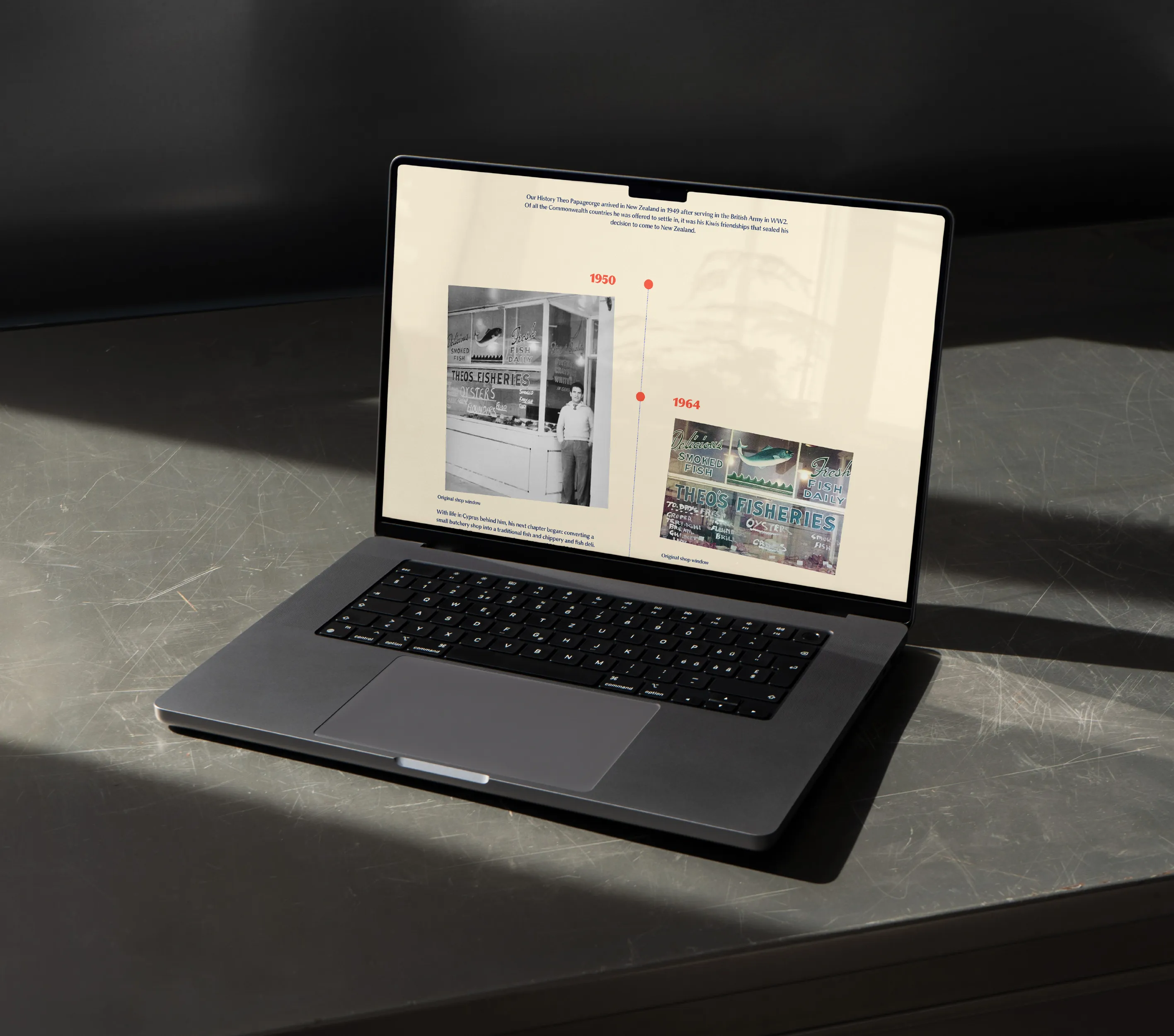
Photography strikes a careful balance between the authenticity of archival imagery and the appeal of product photography. Vintage photographs highlight the brand’s roots while close-up shots of freshly prepared seafood showcase Theo's Fisheries quality, craftsmanship and freshness. This visual approach helps tell a complete story that respects tradition while celebrating modern tastes.
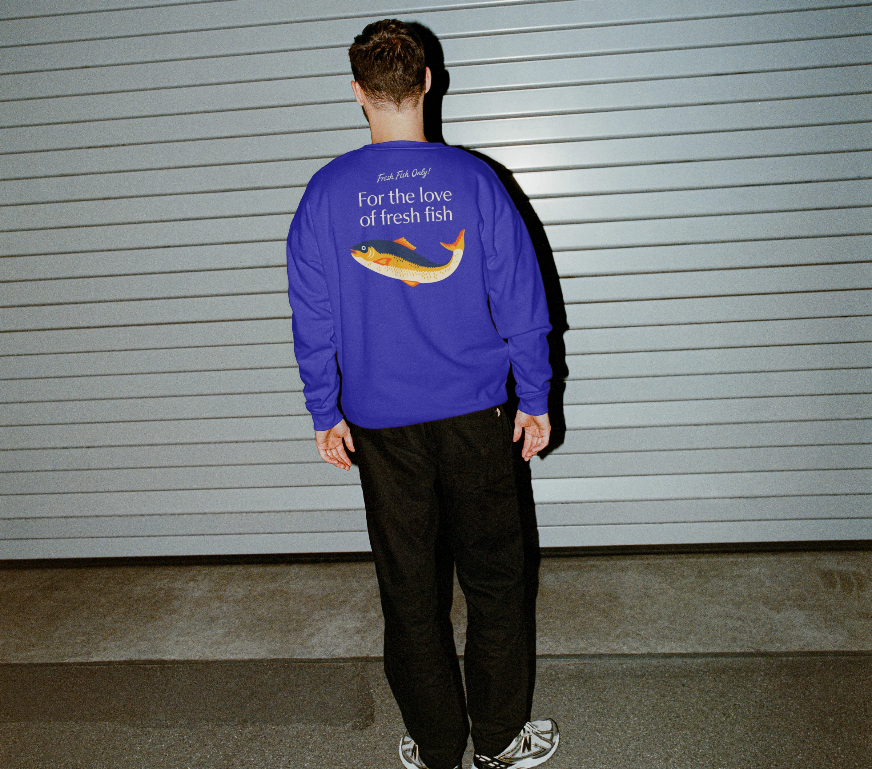
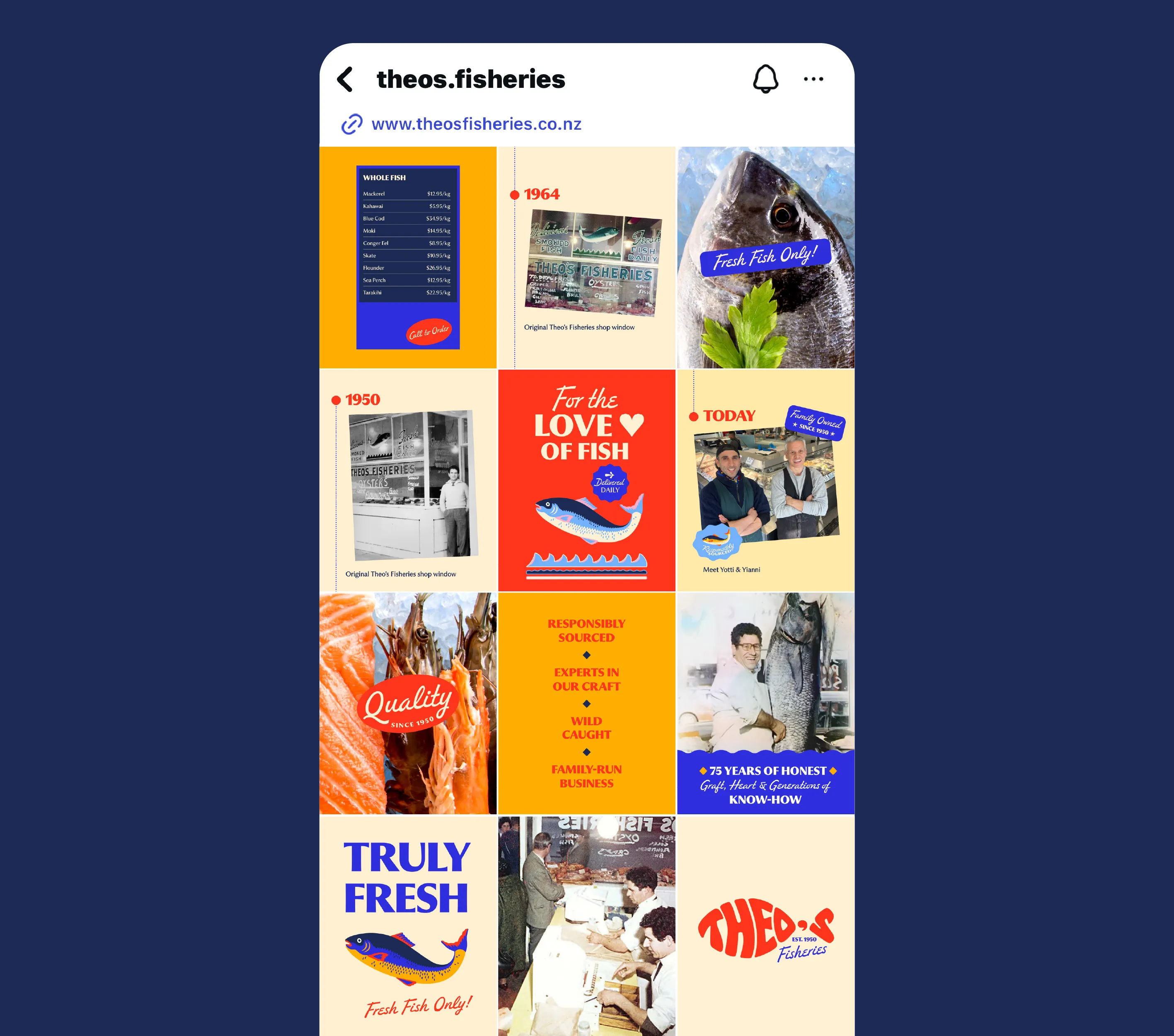
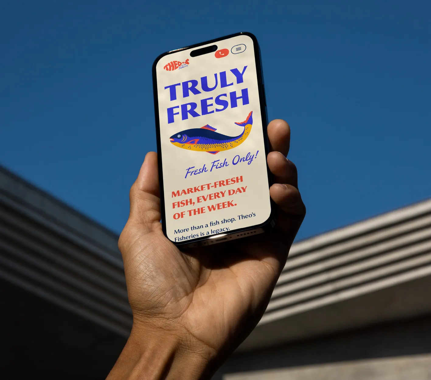
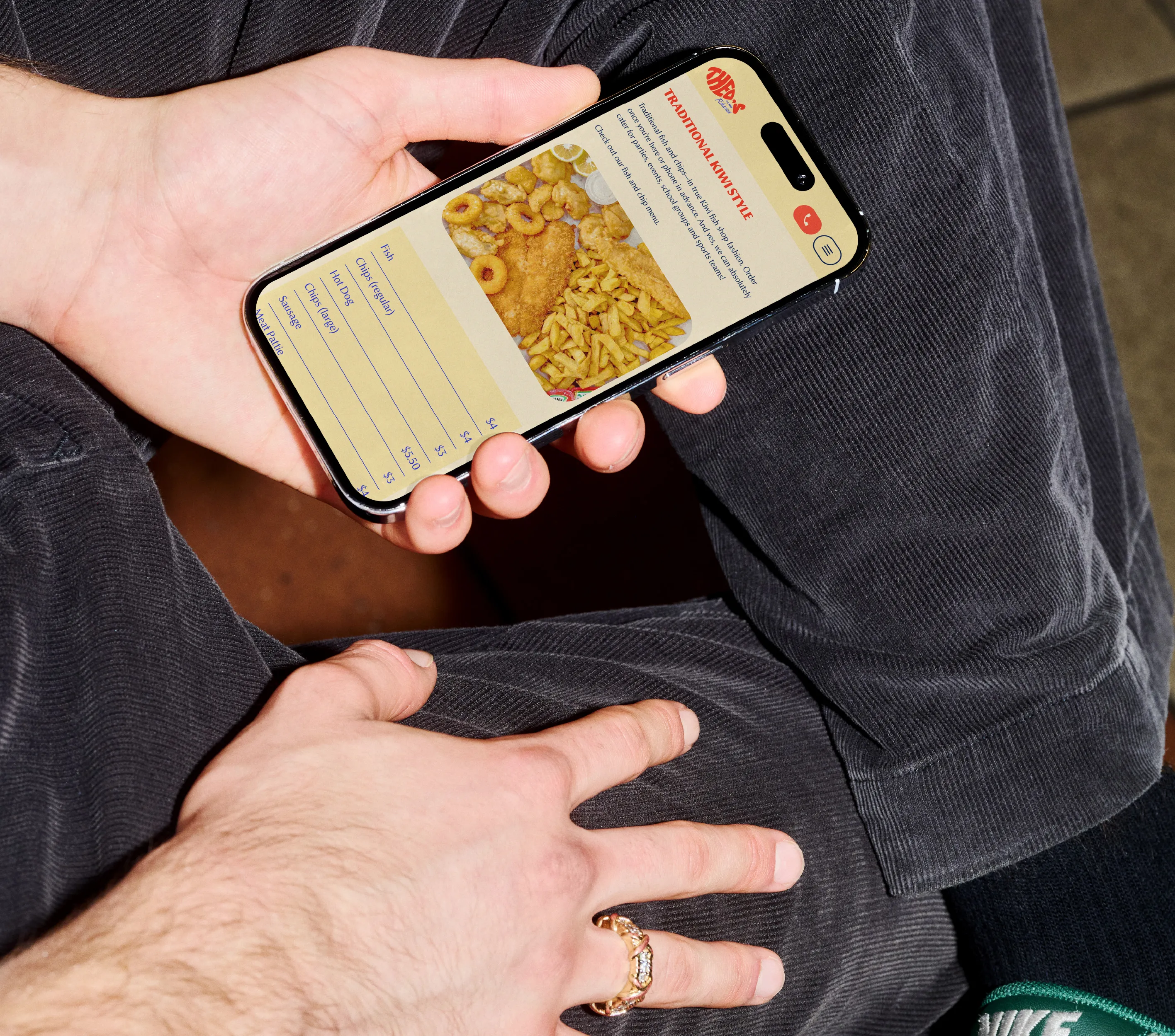
Following the completion of the brand identity, Coside developed a social media launch campaign and a custom website; including the framework, design and copywriting – each vital elements working together to create a strong visual structure and seamless user experience.
The copywriting adopts a bold, friendly and slightly quirky tone that strategically communicates the brand’s values. Bright, playful and nostalgic, the website features the custom illustrations to add personality and archival imagery to foster emotional connection all while staying true to the brand’s rich history, storytelling and voice. More than just visually appealing, the digital presence is intentionally crafted to educate, inform and engage. The result is a warm, authentic and consistently engaging brand experience.
We collaborated with our trusted website development partners, Dotthei Digital Studio to bring the Theo's Fisheries website design to life in Webflow.
This new identity is not about starting over. It is about carrying forward what has always made Theo’s Fisheries special: family, freshness and familiarity. The brand now presents itself with renewed confidence and clarity. It invites both loyal customers and new audiences to connect with something that feels genuine, bold and unmistakably rooted in tradition.
Coside creates monthly content plans and designs for organic social media campaigns and paid advertising plus provides ongoing graphic design support and creative direction for anyone working on the brand.