Brand Identity, Custom Website Design, Illustration, Iconography

The Challenge
Tiny home finance is a relatively new and still-forming category. Builders need specialist support to get approvals through and keep projects on track and often need funding solutions beyond what a traditional bank will offer. Buyers have a different problem: structuring finance for a purchase that doesn't fit the usual mortgage mould.
The brand had to work for both audiences, professional enough for builders and lenders, approachable enough for someone buying their first tiny home. Most of the competition looks the same. Generic financial imagery, sterile language, standard mortgage positioning, a lot of messaging about speed and access. We wanted to move away from that. This is not a normal mortgage conversation so the brand shouldn't be seen like one.
The brand needed to be seen as a specialist guide through a complicated and emerging category. Someone who helps people avoid expensive mistakes and get to outcomes that might otherwise feel out of reach. Rather than compete on speed, the brand needed to stand for trust and genuine guidance and more importantly feel welcoming to people at any stage of the process, without judgement.
The Approach
Positioning as a guide, not a lender chasing speed. Instead of competing in the same territory as every other broker, we built the brand around reassurance and clarity. The idea running through the whole identity is that no matter how small or uncertain someone's starting point is, a good outcome is still possible. Every design decision was checked against that.
The logo
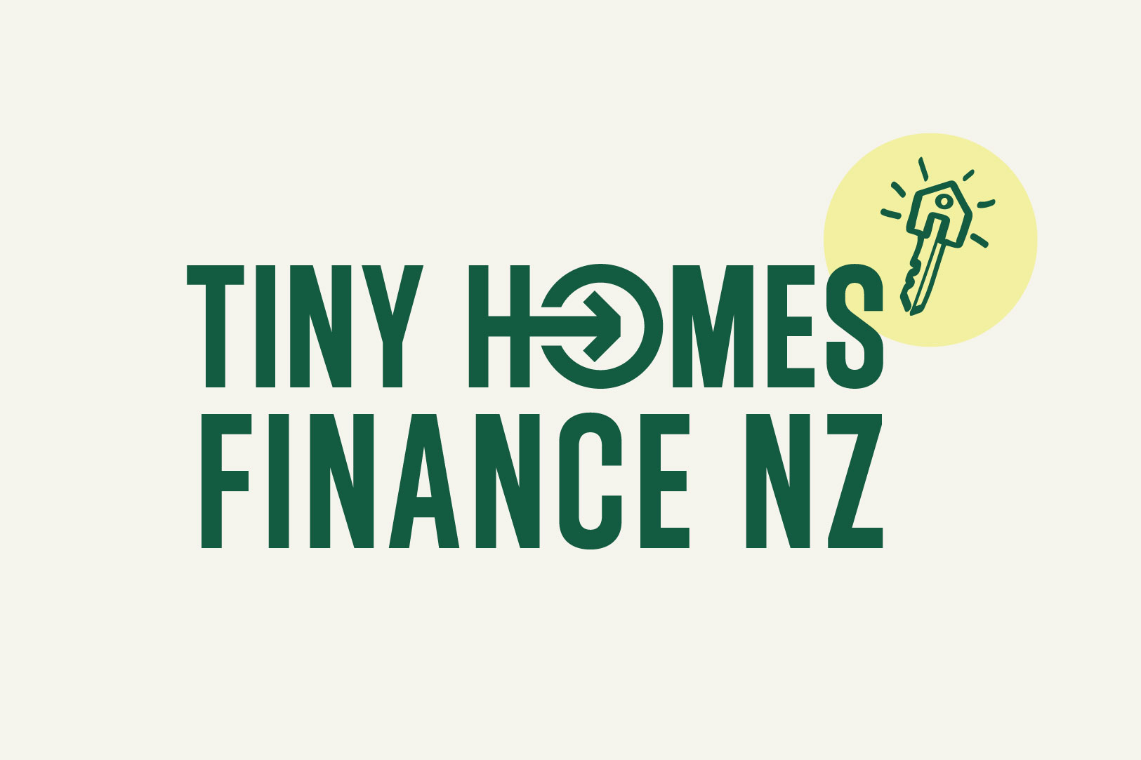
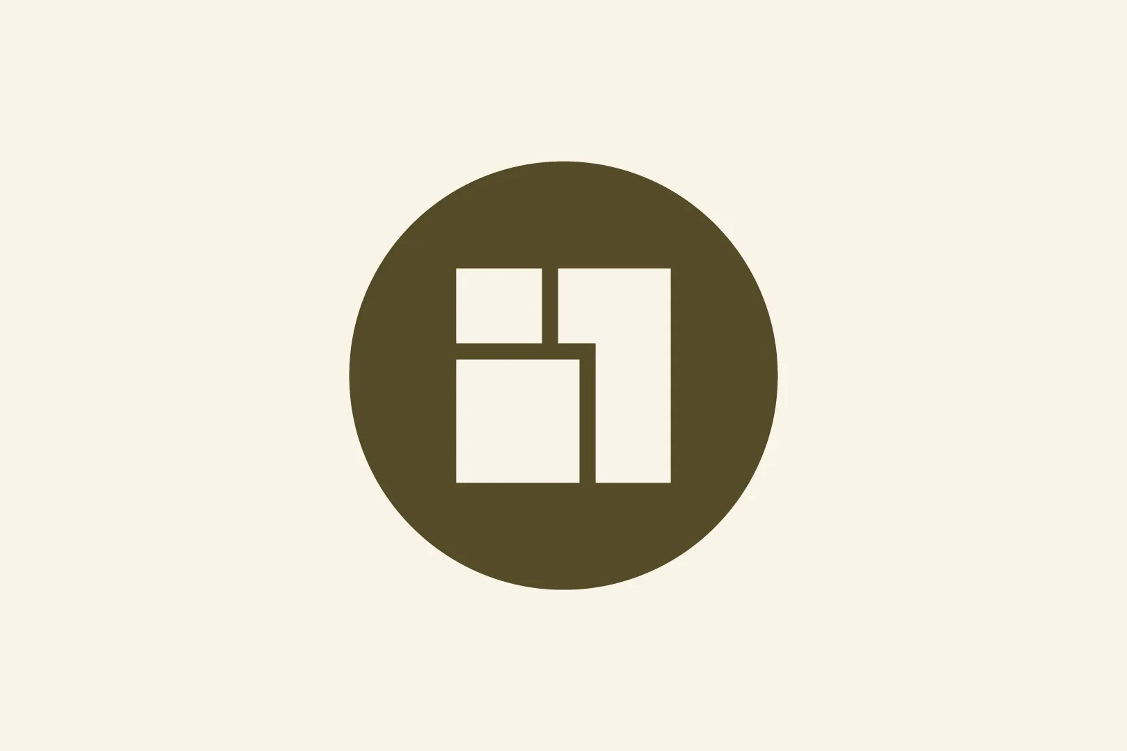
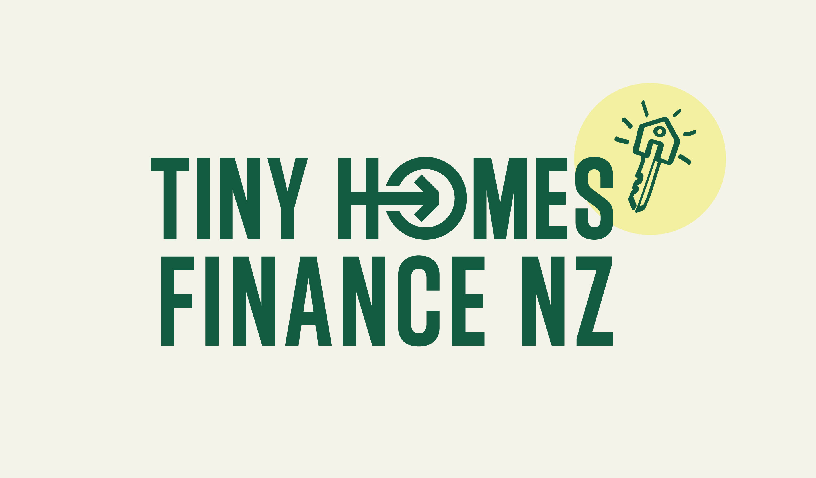
The geometry of a stacked, solid, almost stamp-like mark keeps the logo feeling structured and confident rather than urgent. The condensed, all-caps style nods to the idea of a small footprint doing more with less, the same principle behind a tiny home itself.
The graphic device symbol within the logo mark combines two letters from the word "Home", the H and the O. The H represents the tiny home. It turns into an arrow moving into the circle reading as the customer's journey through the lending process toward an outcome and also as their entry into a wider network of lenders and options. The O reads as a parcel of land seen from above with the arrow marking the spot where the home will be placed. The tail of the arrow connects back into the H so it's one continuous line linking the home to its destination, empty land becoming somewhere to live.
There's a second detail built into the negative space between the two arrowheads which forms a clock face. It's a quiet reference to timing and opportunity sitting alongside the movement and progress already in the mark, the idea being the right funding at the right time. Because it's in the negative space, it doesn't compete or add pressure, it's just there for anyone who looks closer.
Colour
Financial brands tend to sit in navy, black and loud, bright oranges and reds which reads as a sales pitch and pressure so we went a different direction. We are more restrained and calmer with a trustworthy colour palette approach. Forest green stands apart but still connected to the category. A softer blue sits alongside it, keeping some of the trust cues people expect from a financial brand. Off-white grounds the palette and keeps it feeling warm rather than sterile and corporate. A small amount of yellow is used for moments of good news or milestones, adding energy without taking over. Together it avoids the usual industry cues and lands as modern and considered.


Iconography
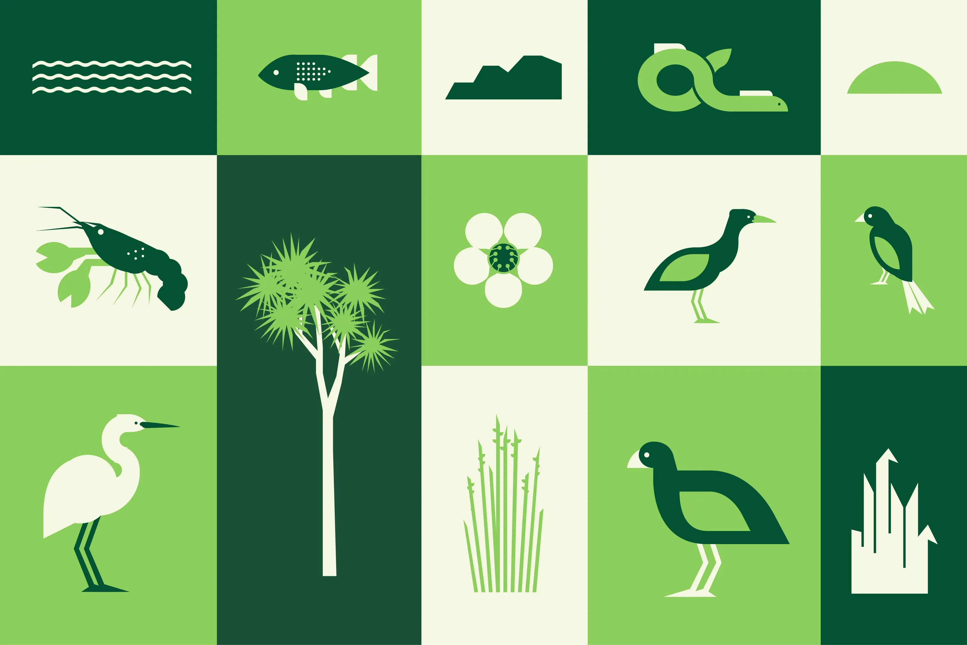
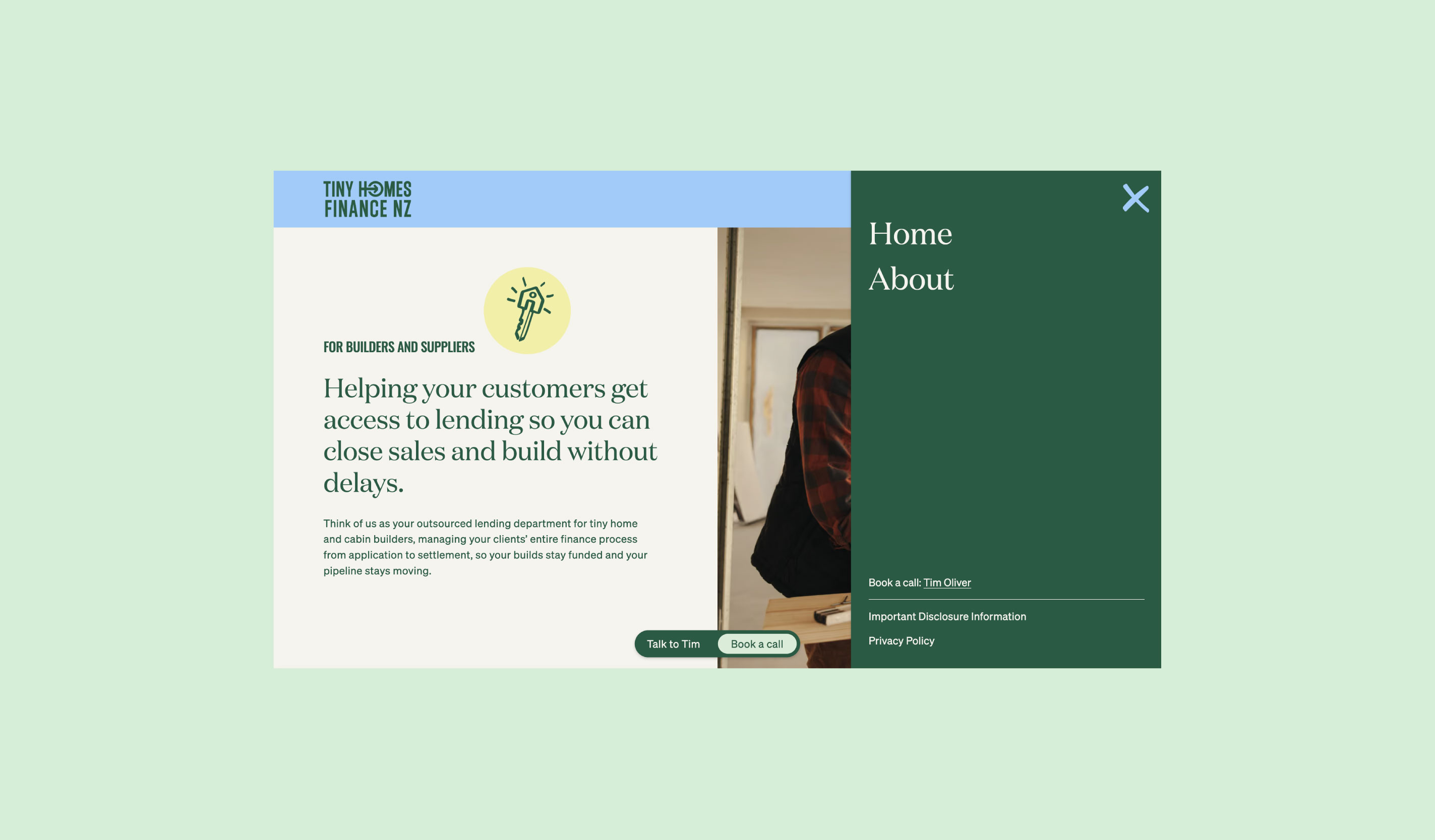
Alongside the geometric logo, we created bespoke, hand-sketched icons throughout the identity. It's a deliberate contrast, the precision of the logo against the informality of a sketch. The sketch style suggests process and ideas being worked through rather than a rigid system to support the collaborative, no-judgement tone the brand needed. It softens the brand what could otherwise feel quite corporate and helps the brand feel like a guided service backed by real people rather than a impersonal, quick cash pressure system.
Custom website
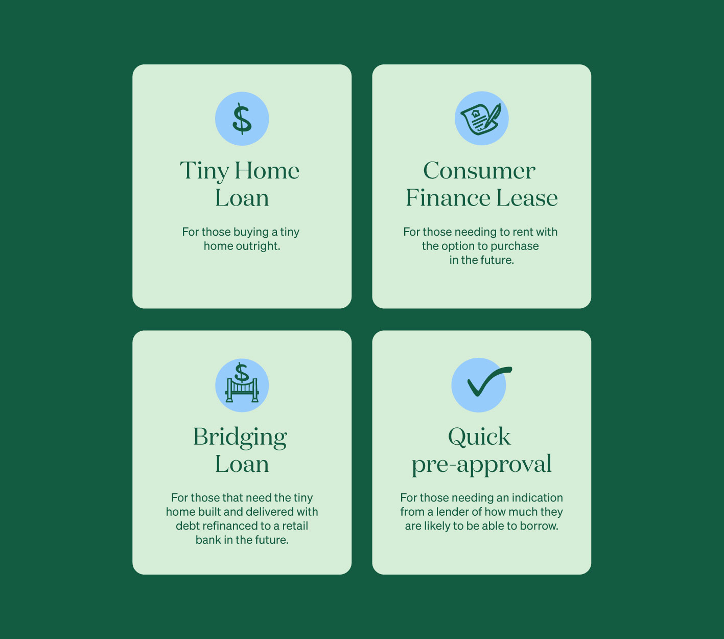
We designed and built the website from scratch rather than using a standard template. Templates are designed to work for a lot of businesses reasonably well which usually means they don't work brilliantly for any one of them. They can tend to hit a ceiling as a business grows or if they needs something outside what the template was built for. Building custom meant every layout, interaction and piece of messaging could be shaped around how this business actually works and needs to communicate rather than adapted to fit someone else's structure.
This approach sets the brand apart in a category full of generic, dated sites, helping it win attention and trust. It’s also built to scale so the website grows with the business instead of holding it back.
The Outcome
A brand that stands apart in a category built on speed, access and pressure by leading with trust and guidance instead.
A minimal logo mark but with real depth. It brings the customer journey of home, land, arrival and timing together in a single connected symbol. Because a logo mark with nothing behind it is easy to ignore, copy or replace but one built on a lasting idea stays relevant through business growth.
A visual identity that feels credible and trustworthy to builders, lenders and approachable to first-time buyers navigating something unfamiliar.
A custom website built around how this business actually operates and needs to communicate so it supports growth instead of being something the business will have to outgrow.
"Working with Samantha was great. She took hold of the project and delivered beyond expectations. I’m overjoyed with the result. The brand is clean and professional and really encapsulates what I want to convey about my business. Sam listened, came up with great ideas and delivered something that I’m proud to put into the market".